


Marks398 logo identities by João Queirós
- 398 identities
- 160 pages
- 5 forms
- 24 closer looks

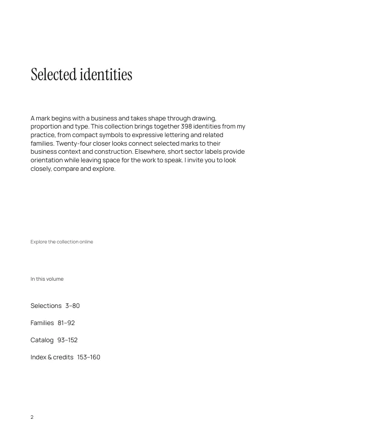
A mark begins with a business and takes shape through drawing, proportion and type. This collection brings together 398 identities from my practice, from compact symbols to expressive lettering and related families. Twenty-four closer looks connect selected marks to their business context and construction. Elsewhere, short sector labels provide orientation while leaving space for the work to speak. I invite you to look closely, compare and explore.
From the introduction to Marks, a 160-page book of selected identities.
The object
Before it was a page on a screen, it was a book. Scroll to open it.
Drawn, path by path
Five marks from the book, rebuilt from its own vector files. Scroll and each one is drawn again, line by line, over its construction guides.
-
 01 / 05
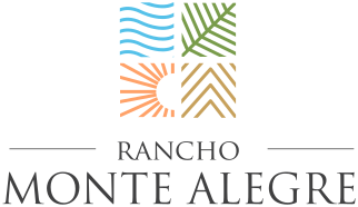
Rancho Monte Alegre
Rancho Monte Alegre is a residential estate in Santa Barbara. Four illustrated panels bring together sun, sea, plants and mountains, turning the landscape into a compact square emblem that balances natural subjects with a clearly ordered structure.
See the Rancho Monte Alegre case study → -
 02 / 05
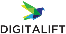
Digitalift
Digitalift provides digital advertising services. Its multicoloured origami bird brings angular planes together in a compact silhouette, translating the agency’s name into a sense of movement and lift.
See the Digitalift case study → -
 03 / 05
Aspen Capital Group
Aspen Capital Group invests in real estate and operating businesses in the American Midwest. Interlaced A-C-G initials and a small mountain peak turn the company name into a compact, classical monogram.
See the Aspen Capital Group case study → -
 04 / 05
Wind Dancer
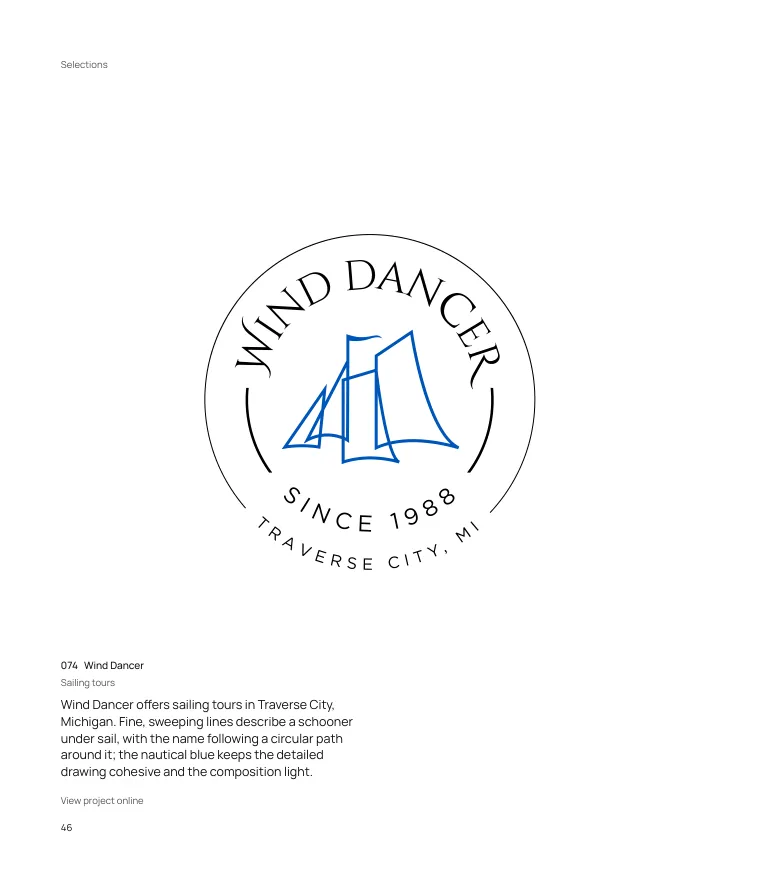
Wind Dancer offers sailing tours in Traverse City, Michigan. Fine, sweeping lines describe a schooner under sail, with the name following a circular path around it; the nautical blue keeps the detailed drawing cohesive and the composition light.
See the Wind Dancer case study → -
 05 / 05
The Turf
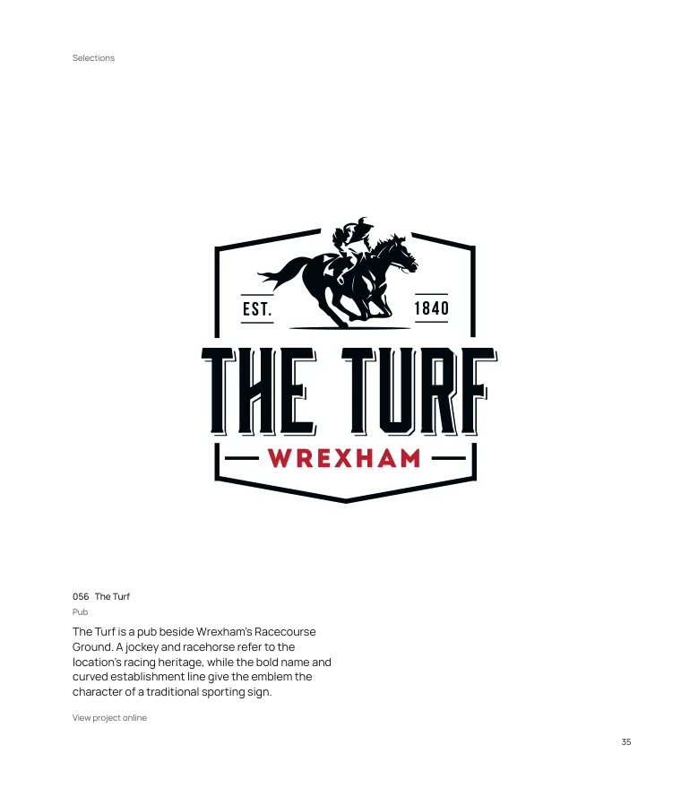
The Turf is a pub beside Wrexham’s Racecourse Ground. A jockey and racehorse refer to the location’s racing heritage, while the bold name and curved establishment line give the emblem the character of a traditional sporting sign.
See the The Turf case study →
Five forms
Every identity in the book takes one of five forms. Keep scrolling and all 398 sort themselves.
One name, forty identities
Agent inc. is a real estate brokerage with a family of related services. Its lowercase wordmark gives the family a shared base, while each sub-brand adds its own symbol, colour and descriptor to the name.
Facing pages
Some spreads in the book were paired on purpose. Scroll, or drag the gutter, to give each page the room.
 16
 17
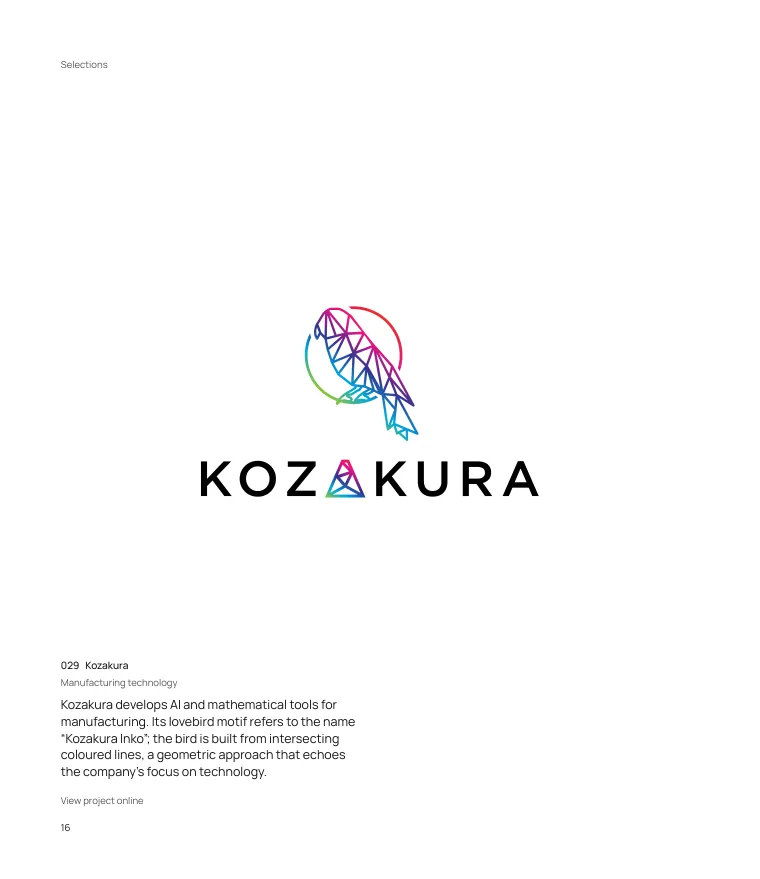
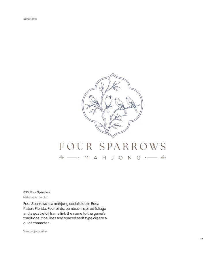
A bird built from intersecting coloured lines, facing four birds drawn among bamboo-inspired foliage. Two ways to draw the same subject, set side by side.
 62
 63
A fluid, calligraphic D and R facing interlocking L and H strokes. Two monograms for real estate professionals, one signature-like, one structured.
Twelve years of marks
174 of the 398 identities have a recorded year. Here they are, from 2014 to 2025.
2014
3 marks2015
13 marks2016
13 marks2017
20 marks2018
23 marks2019
26 marks2020
20 marks2021
23 marks2022
6 marks2023
7 marks2024
11 marks2025
9 marksAll 398, at once
Drag to explore the whole collection. Zoom with the buttons, a pinch, or Ctrl and the mouse wheel. Select any mark for its details.
Browse the full index of 398 identities
Read it, cover to cover
The full screen edition: every page, the index, and the 24 closer looks with their notes.
Every mark starts with a conversation.
If your business needs a mark that holds up on a sign, a screen and the page of a book, let’s talk about it.
Browse the logo portfolio · Read the case studies · The 5 types of logo, explained