Aspen Capital Group Real Estate & Investment Brand Identity & Logo Design
A refined, masculine identity for a family-owned real estate and investment group, built around an AGC monogram and a quiet mountain peak that signal stability, wealth, and long-term stewardship.
The Brand
Aspen Capital Group is a family-owned organization that creates and invests in real estate and operating businesses across the Midwest. Because the group only manages assets owned by its principals, it keeps full control over every holding and handles each matter professionally, ethically, and with long-term care. The mission is simple: improve quality of living through real estate, products, and services.
The Design
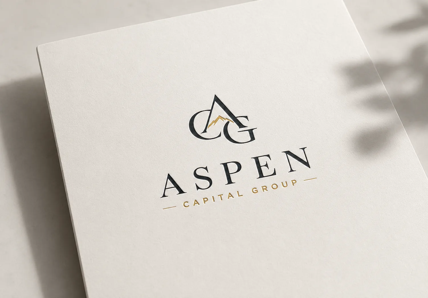
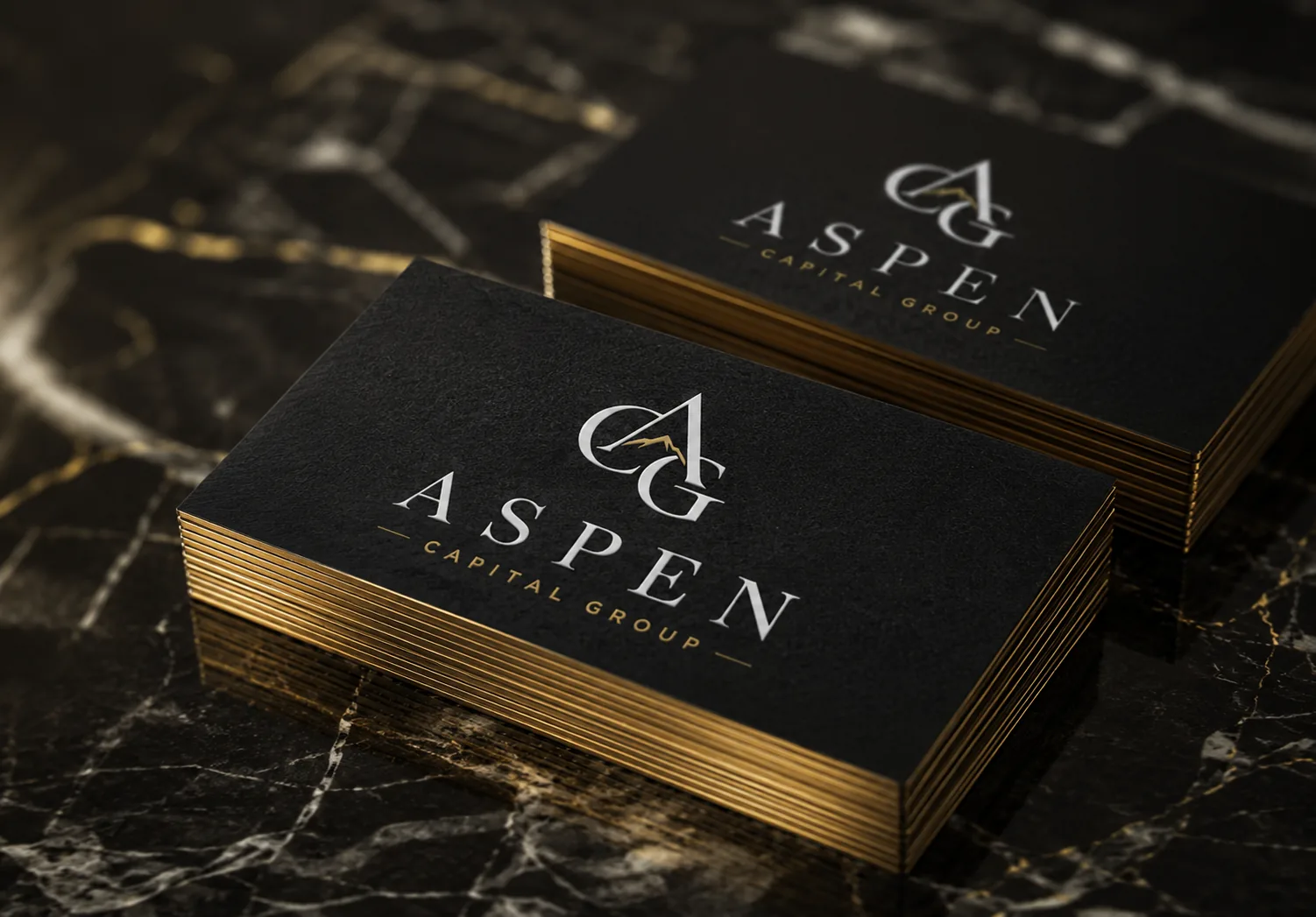
The brief called for a brand that felt masculine, classic, and established, with darker shades that communicate class, wealth, and trust. I built the identity around an AGC monogram with a small mountain peak nested between the letters, a quiet nod to the Aspen name and to durability. A classic serif wordmark, a deep charcoal and gold palette, and generous spacing give the mark a sense of permanence rather than passing trend.
The Identity in Use
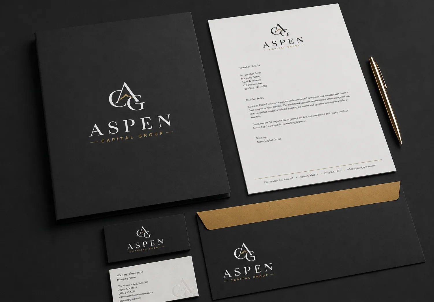
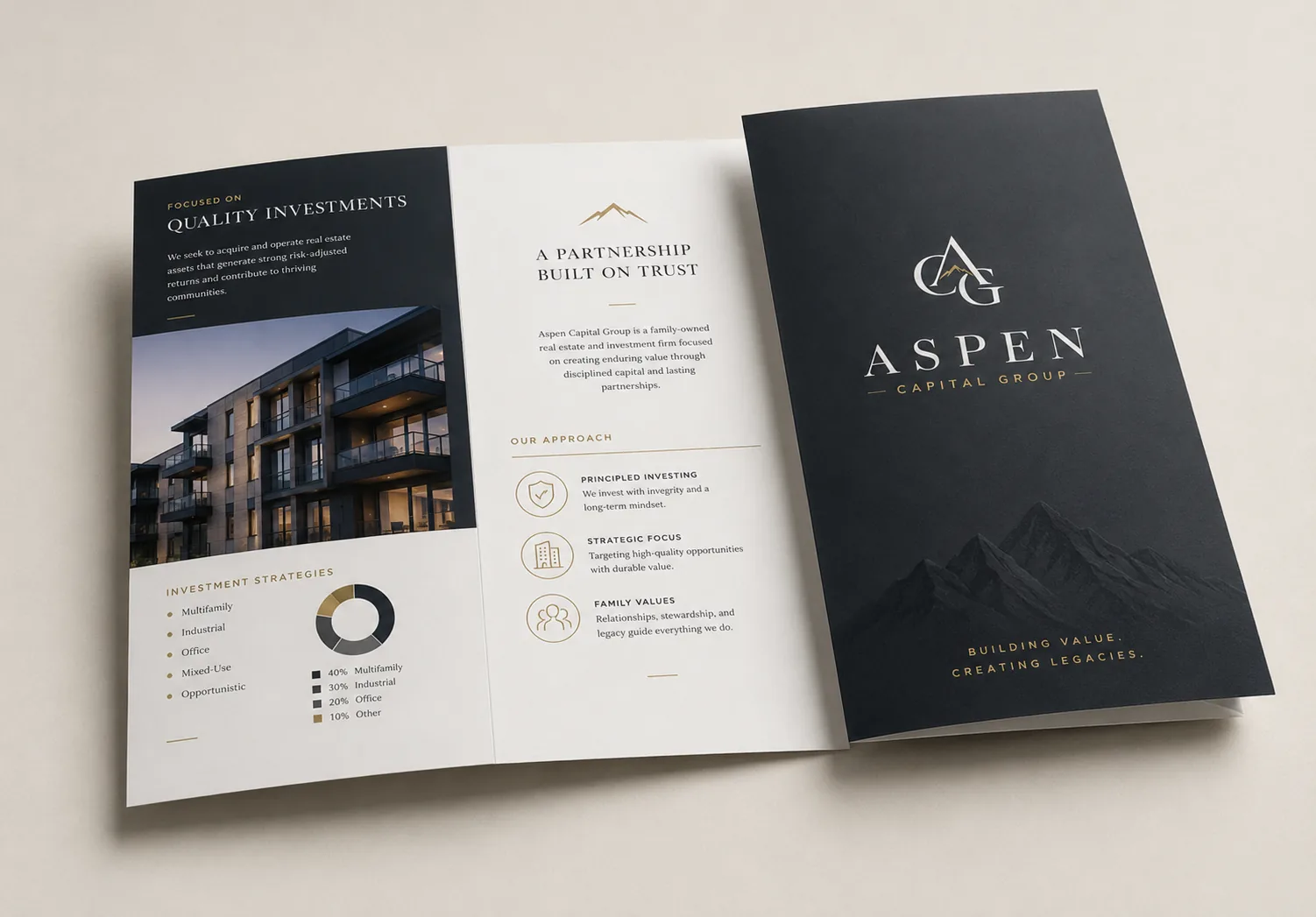
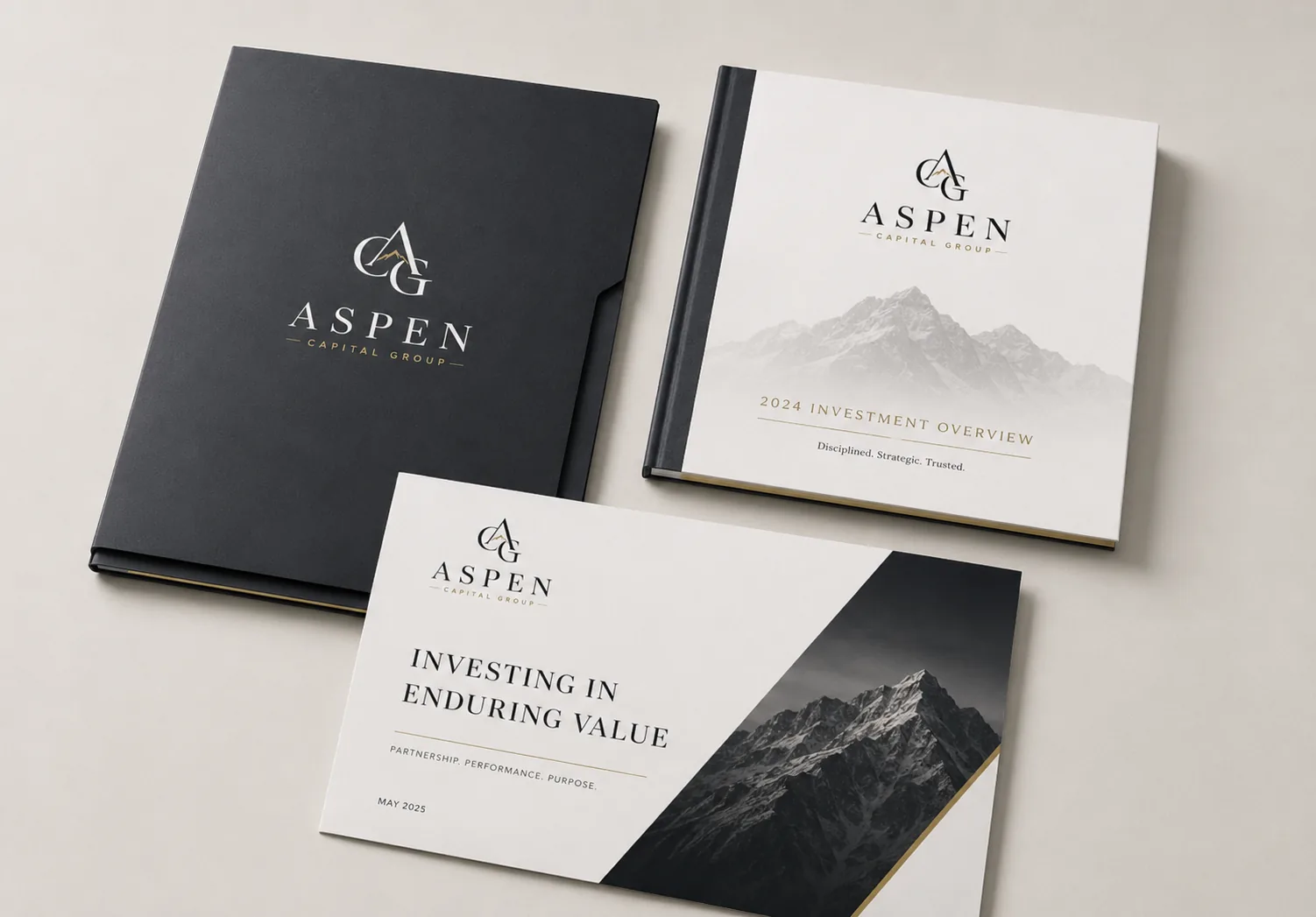
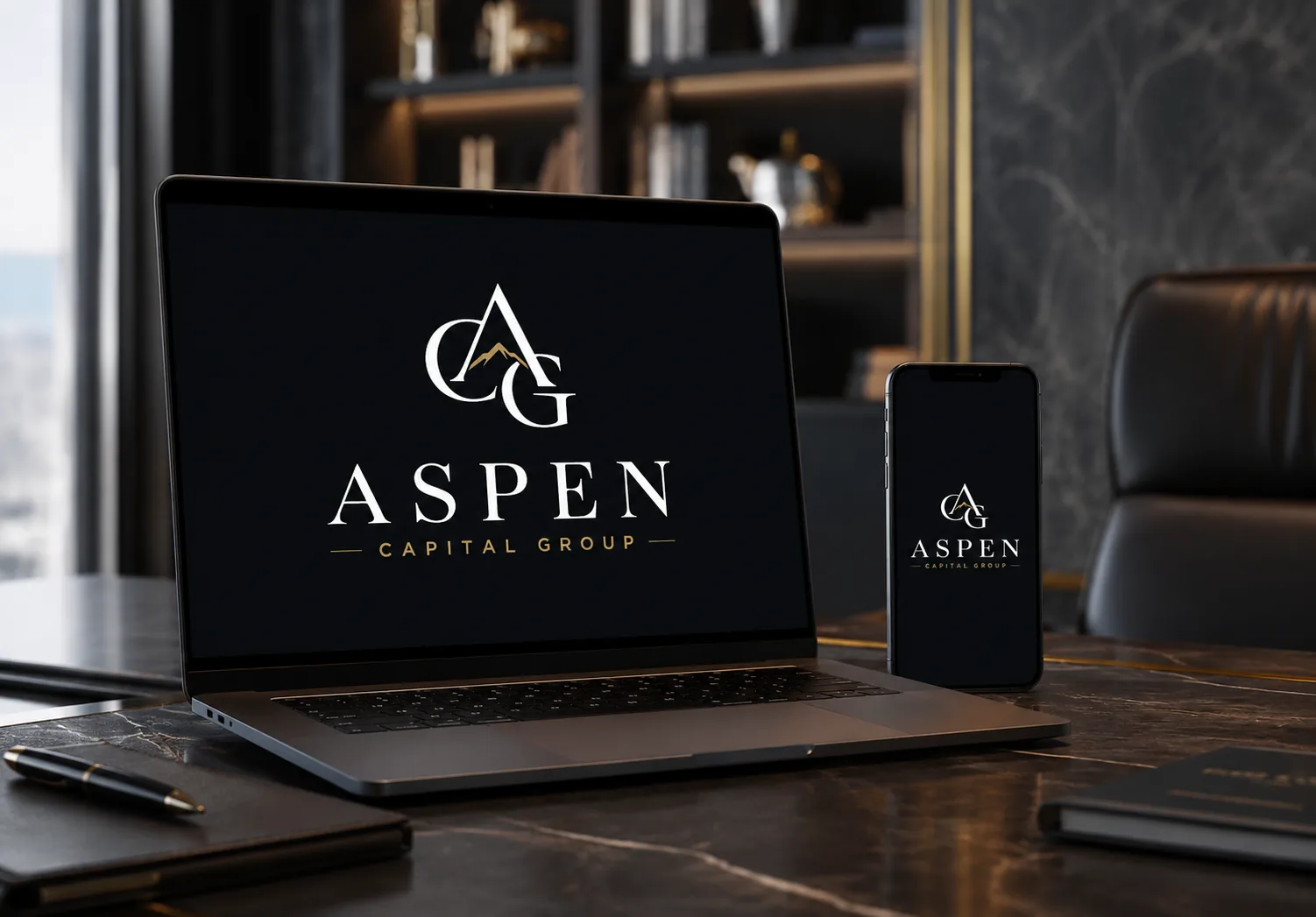
From there the identity was extended into a full system: letterhead and correspondence, gold-edged business cards, a trifold investor brochure, hardcover brand books, and exterior monument and lobby signage. The dark and gold palette holds its weight on premium stock and on screen, so the brand feels consistent whether it appears on a folder handed across a boardroom table or on a sign at the entrance to a development.
The supporting imagery follows the same thinking. Rather than generic finance stock, Aspen pairs the mark with calm, considered scenes: a meeting with mountains in the distance, a handshake closing a deal, a development welcoming new residents. That pairing tells investors and partners in a single glance that this is a group built on relationships and long horizons, not quick transactions.
The Result
The finished identity gives Aspen Capital Group the look of an established institution from day one. The AGC monogram scales cleanly from an embossed business card to a building sign, the colour system works on both dark investor materials and light printed pieces, and the whole brand carries the quiet confidence the family wanted: classic, secure, and made to last.
This project is part of the brand identity design services I offer to clients worldwide.


Your next client's first impression starts here.
Let’s create a brand identity that stands the test of time.
1,200+ brands. 40+ countries. Since 2014.