Four Sparrows Mahjong
A serene, quietly luxurious identity for an elevated mahjong social club at Mizner Park in Boca Raton, Florida.
Brand mark, stationery language, and palette direction for the private-club inspired identity.
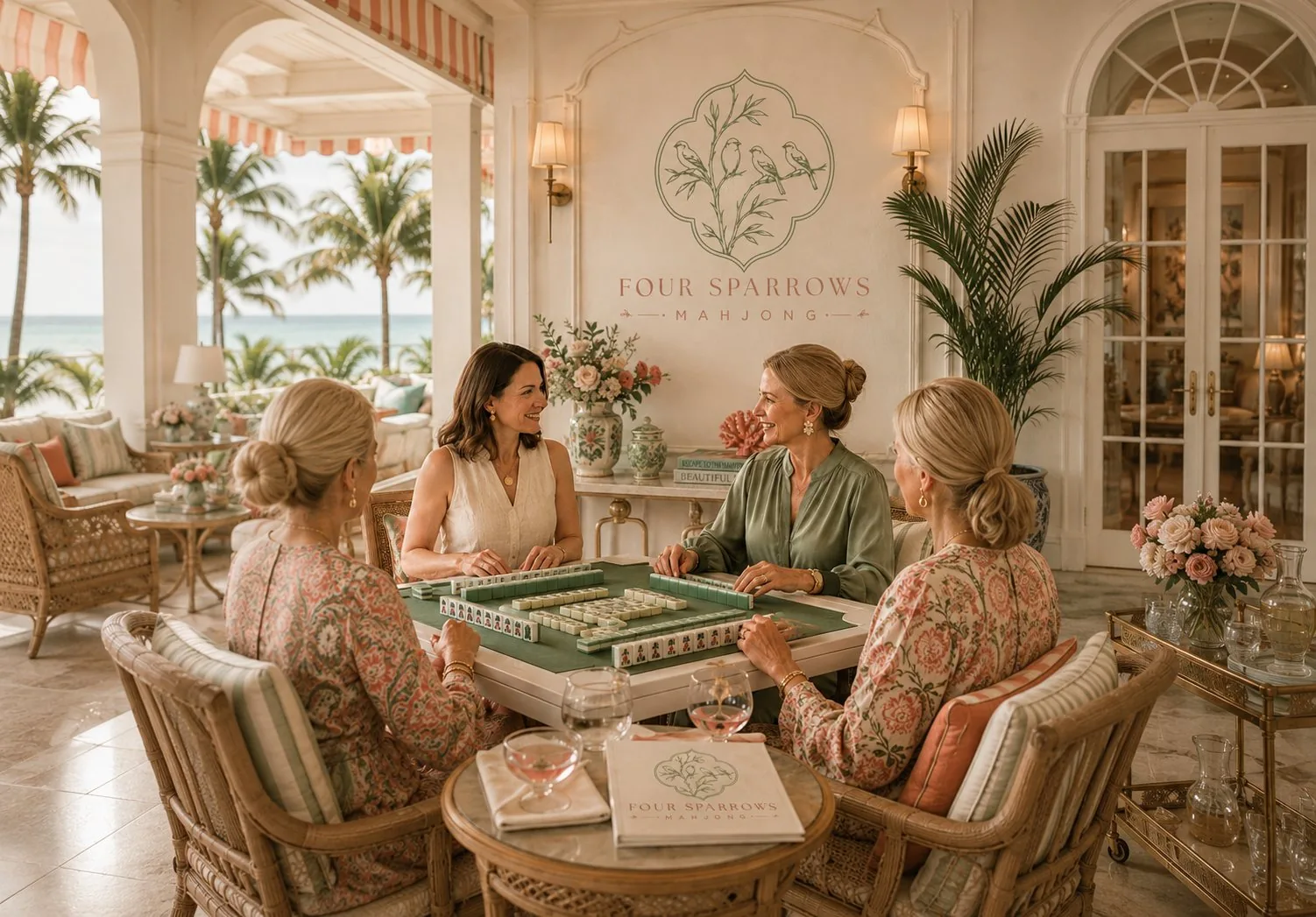
A destination for women to play, socialize, and unwind in genuine luxury.
Four Sparrows needed to feel like more than a game night. The brand had to signal a refined gathering place: feminine without being precious, elegant without feeling stiff, and rooted in the quiet pleasure of ritual.
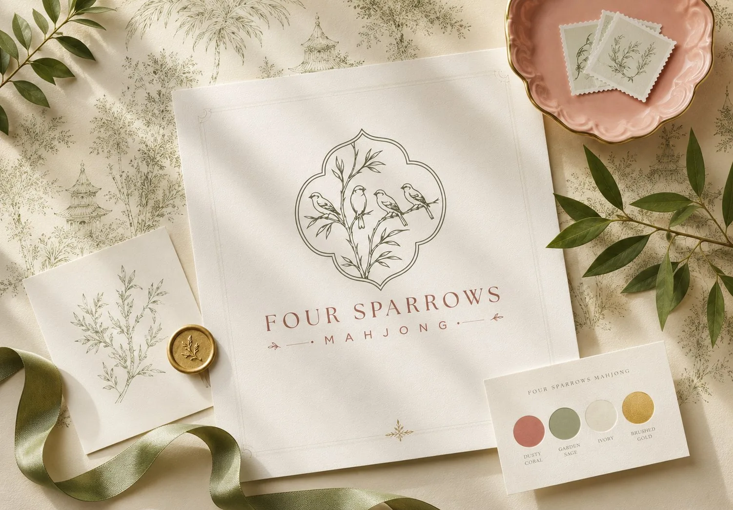
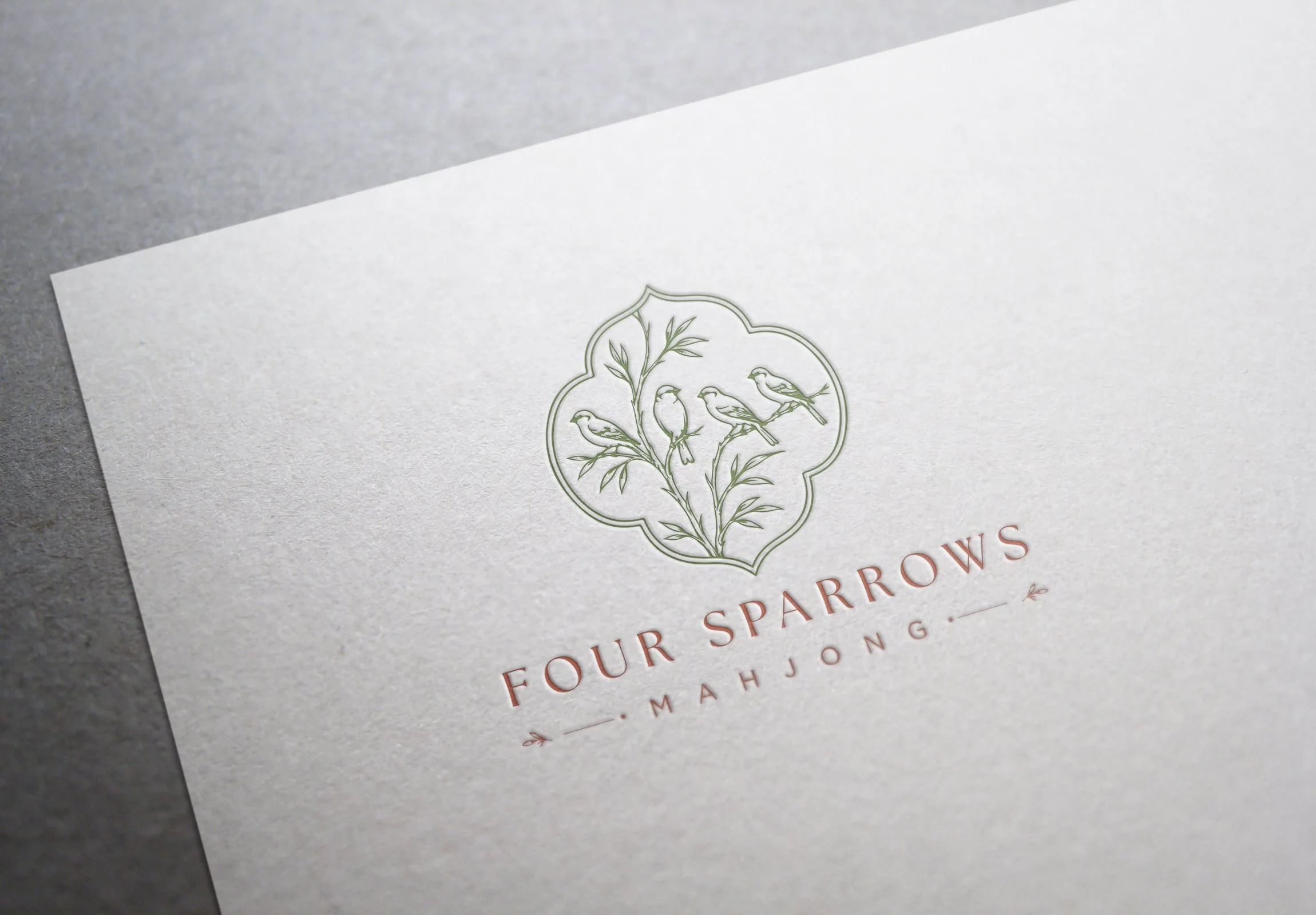
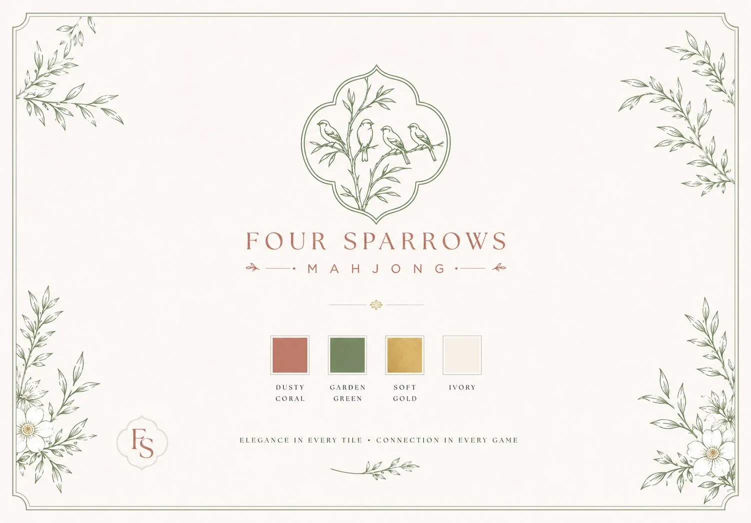
The name carried its own logic. Mahjong derives from the Chinese word for sparrow, and a winning hand requires four sets. That gave the identity a natural symbol system: four sparrows, delicate botanical structure, and a sense of balance that quietly explains the concept without making it literal or kitschy.
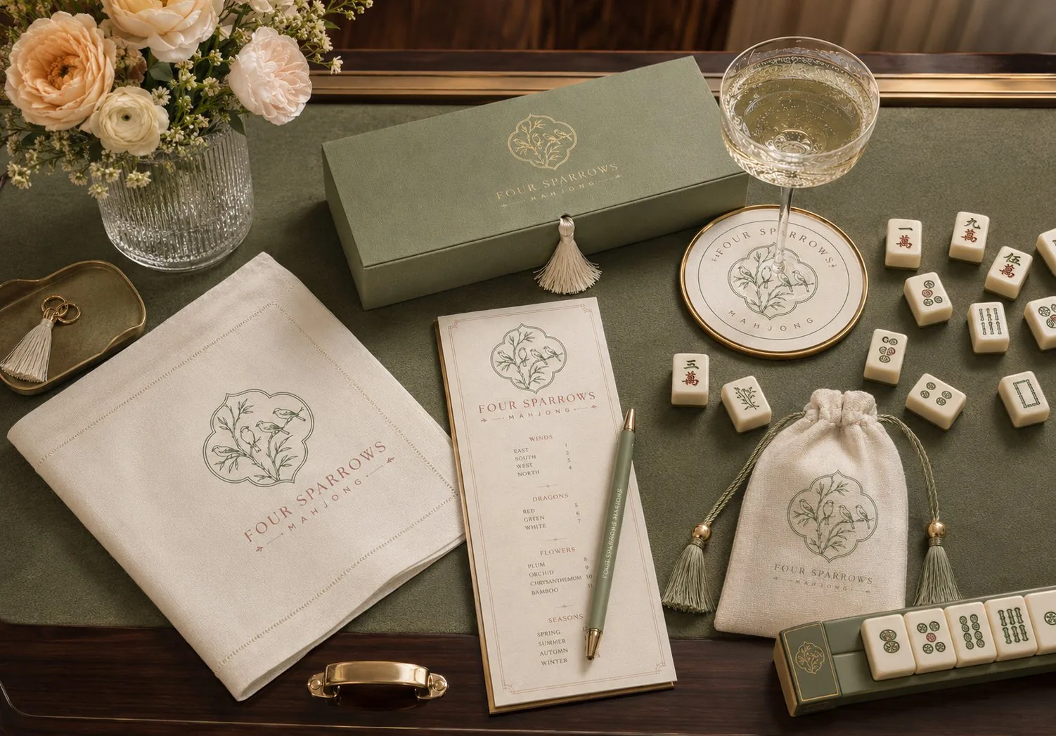
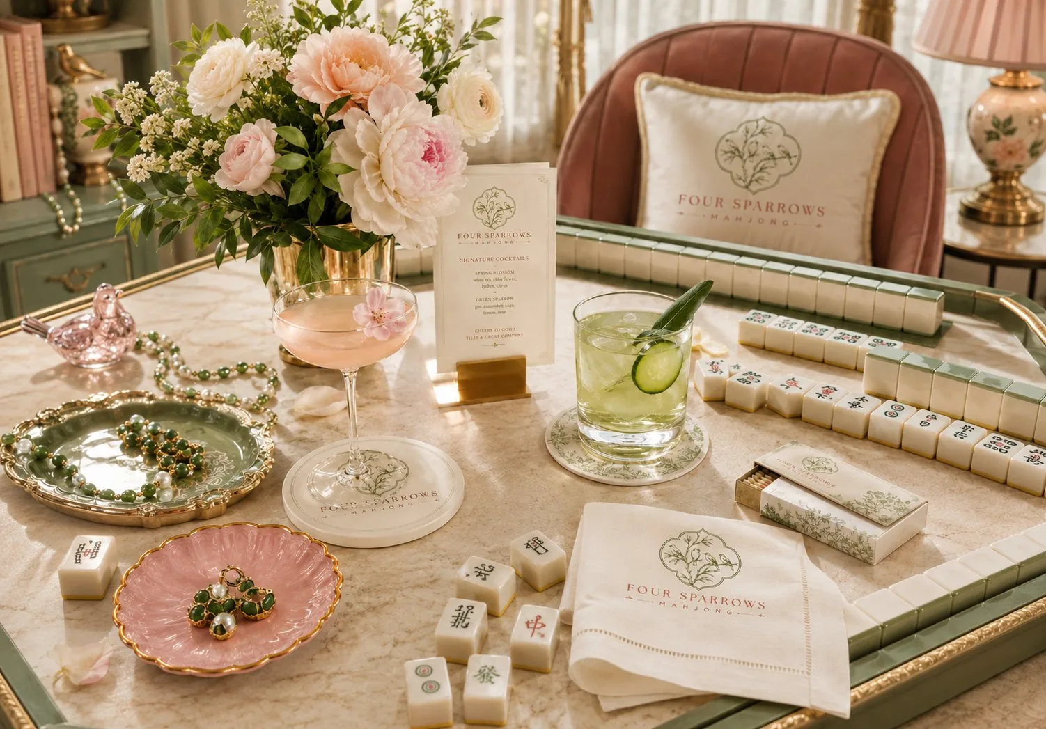
Botanical detail, private-club typography, and a mark built to feel collected over time.
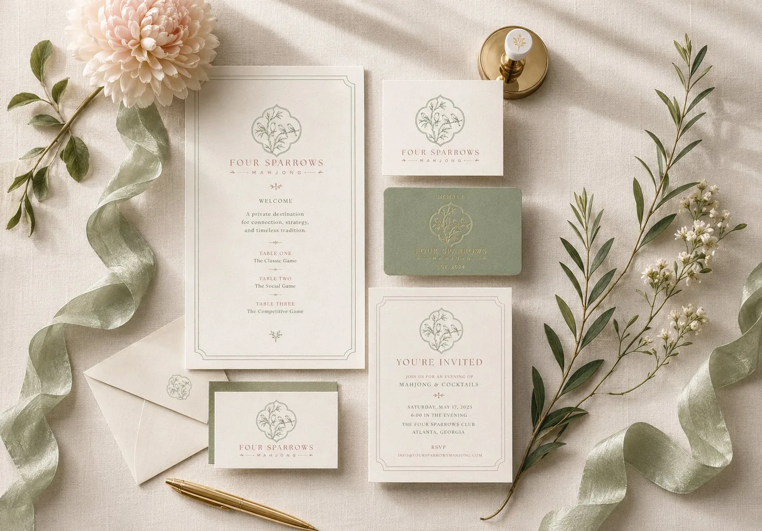
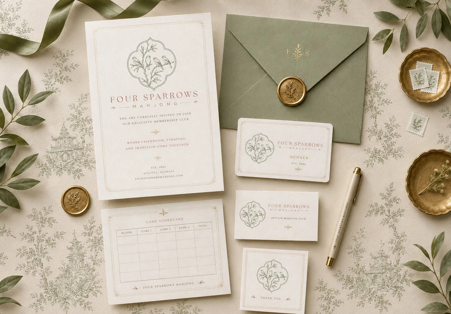
The final direction pairs four sparrows with bamboo-inspired foliage inside a soft quatrefoil frame. The shape nods to chinoiserie and old resort architecture, while the fine-line illustration keeps the mark refined enough for stationery, signage, menus, table details, and club collateral.
The typography uses generous spacing and a classic serif voice to create the feeling of engraved stationery. The result sits at the intersection of Hamptons restraint, Palm Beach softness, and Old Florida hospitality.
A sun-faded palette with enough warmth to feel social.
The color system uses sage green and dusty pink as the core identity colors, supported by ivory and brushed gold for a quiet luxury finish.
Designed to live beautifully across every guest touchpoint.
The system extends from invitations and membership cards to score sheets, table markers, packaging, and keepsake stationery.
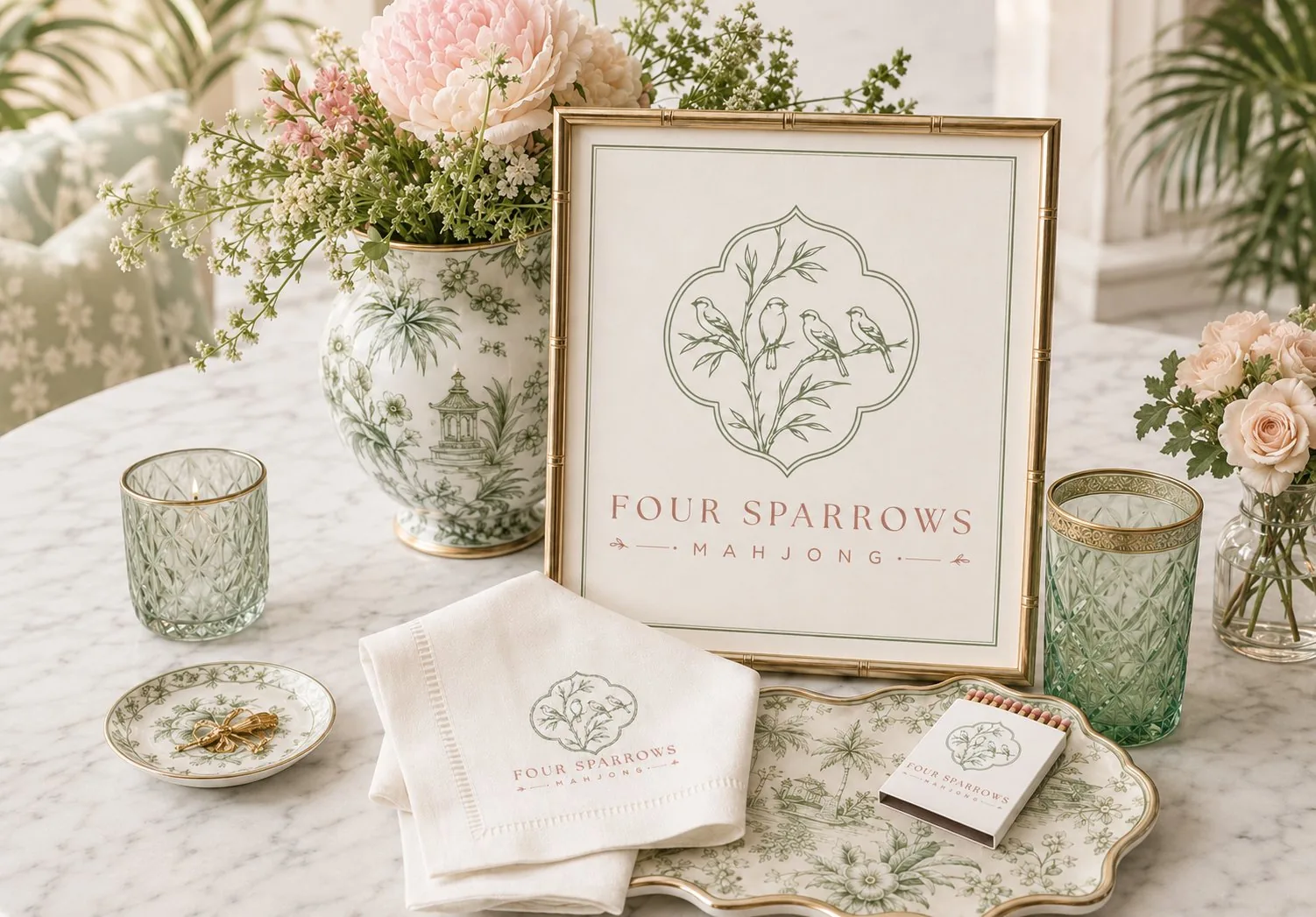
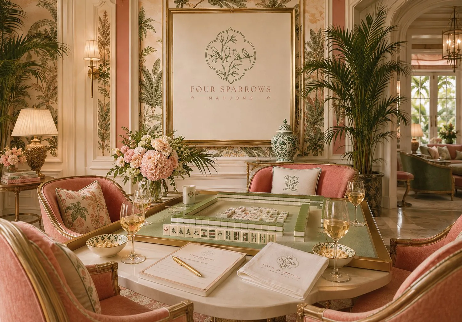
Old Florida charm, subtle chinoiserie, and a room made for lingering.
The visual language was built to feel at home in a space with palms, pattern, soft upholstery, flowers, polished tableware, and the relaxed confidence of a Palm Beach veranda.
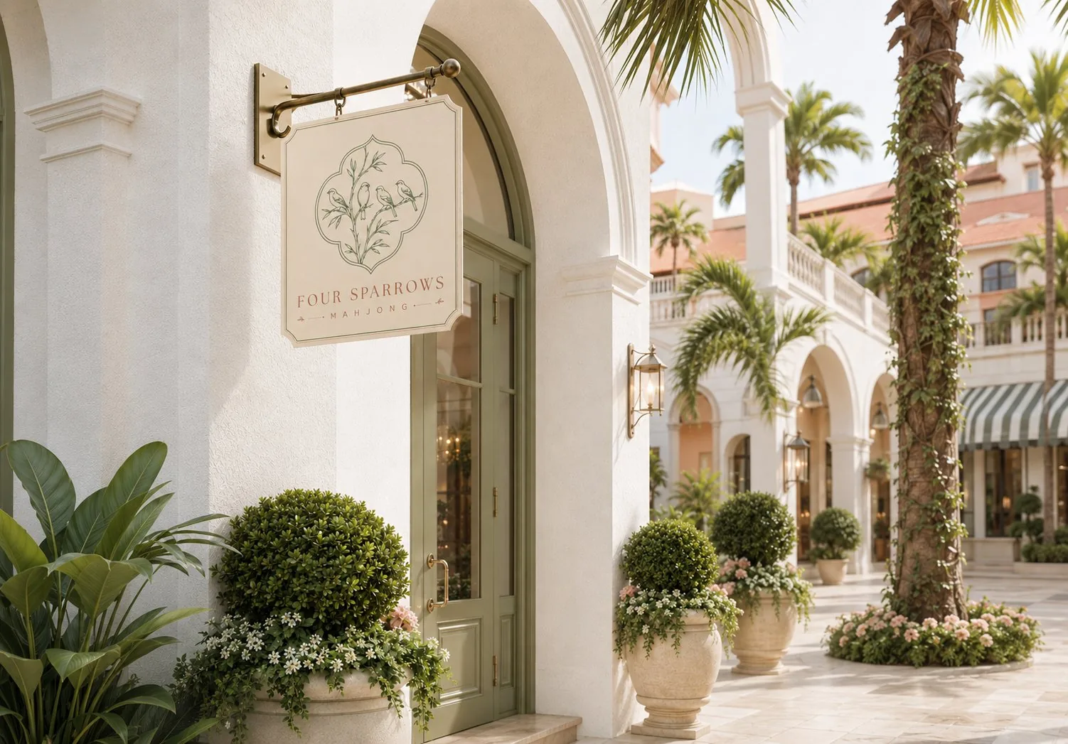
A mark refined enough for stationery, visible enough for a destination.
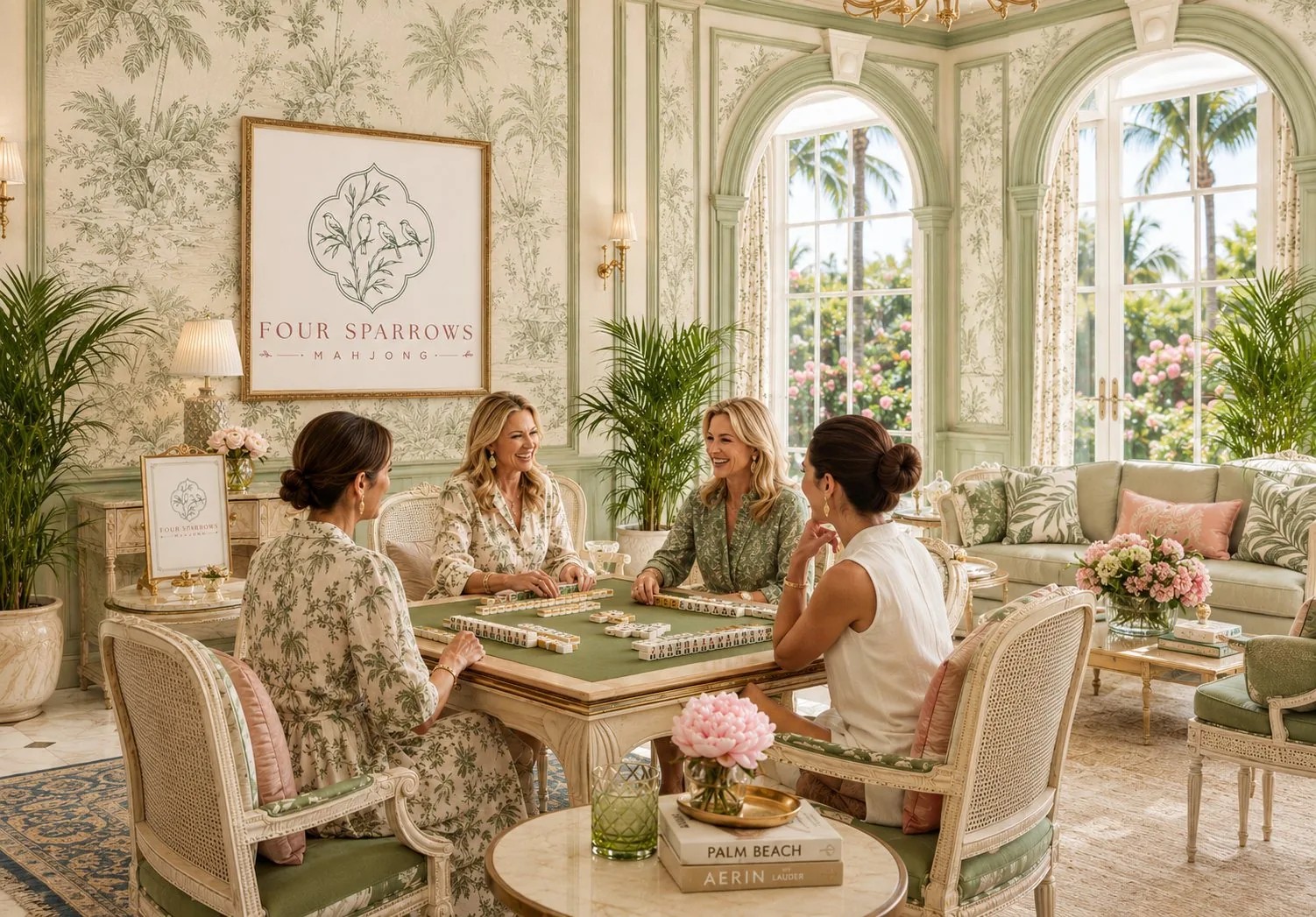
The exterior expression keeps the same line quality and soft palette, translating the private-club feeling into a public-facing sign for Boca Raton.
It gives Four Sparrows the presence of a boutique hospitality venue while preserving the serene personality that makes the brand feel distinctive.
The Result
Four Sparrows Mahjong now has a brand identity that carries the meaning of the name and the mood of the space. The sparrow motif connects directly to the origin of mahjong, the four birds echo the four-set structure of a winning hand, and the overall system gives the club a visual language that can scale from a single card to a full hospitality environment.
This project is part of the brand identity design services I offer to clients worldwide.
Let's give your business the identity it deserves.
Let's create a brand identity that stands the test of time.
1,200+ brands. 40+ countries. Since 2014.