Danada Craft Beer Packaging & Brand Identity Design
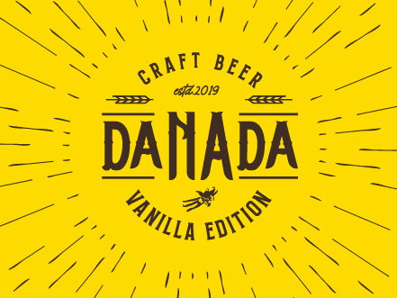
A bold, vintage-inspired visual identity for Porto’s Vanilla Edition craft beer - warm yellows, retro typography, and a dynamic sunburst motif evoking the rich, creamy vanilla notes inside every bottle.

The Brewery
Danada is an independent craft brewery based in Porto, Portugal. For their special limited-release “Vanilla Edition,” they wanted packaging that would instantly catch the eye on the shelf while clearly expressing the beer’s distinctive sweet and smooth vanilla character.
The Design
We created a bold and cohesive visual identity, including a complete rebrand and packaging redesign to refresh the brand’s image. This involved new graphic elements, a redesigned logo, and a striking bottle label.
The new logo for Danada’s latest beer, LEVARE - a name derived from Latin, linked to “levedura” (yeast) and carrying the meaning of “to rise,” “to grow,” or “to elevate” - was conceived to project a mature, confident, vibrant, and youthful personality.
The label features a warm “Vanilla Yellow” dominant palette paired with retro-inspired typography and a dynamic sunburst motif that radiates energy and softness, evoking the rich, creamy vanilla notes inside. The final result is a bottle that feels authentically handcrafted yet boldly contemporary, perfectly balancing tradition and modernity.
The Result
The redesigned packaging gave Danada a shelf presence that competes well beyond Porto’s local craft beer scene. We chose the saturated “Vanilla Yellow” specifically because it breaks from the dark, hop-heavy palettes that dominate the category, making the bottle impossible to miss in a crowded bar fridge or bottle shop display. The LEVARE logo, with its Latin roots and upward energy, signals ambition without losing the approachable, handcrafted character the brewery is known for. Early feedback from stockists confirmed the new labels were driving noticeably higher pick-up rates compared to the previous design.
This project is part of the brand identity design services I offer to clients worldwide.


Your next client's first impression starts here.
Let’s create a brand identity that stands the test of time.
1,200+ brands. 40+ countries. Since 2014.