Quest RTS Software Brand Identity & Logo Design
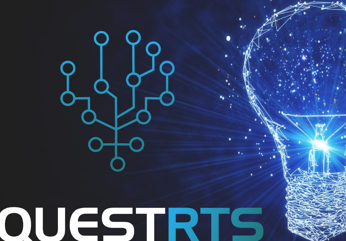
A “Circuit Tree” symbol for an Oklahoma-based logistics software company - combining the connectivity of a circuit board with the organic branching of a tree to represent growth, adaptability, and technological precision.
The Challenge
Quest RTS (Remote Technology Solutions) specializes in advanced logistics software for iOS and Web. The branding challenge was to visualize the complexity of their network in a clean, modern symbol.
The Design
We created a “Circuit Tree” icon - a geometric structure that combines the connectivity of a circuit board with the organic branching of a tree. This represents the company’s ability to grow and adapt while maintaining rigid technological precision. The electric blue color palette reinforces trust, speed, and digital clarity.
The Result
The Circuit Tree icon doubles as a recognizable app icon for Quest RTS’s iOS and web platforms, giving the software an identity that users associate with reliability before they even open it. The symbol’s geometric modularity allowed us to derive secondary patterns and UI elements from the same visual language. For a logistics company operating in a technical space, the brand now communicates innovation and scale without relying on generic tech cliches.
This project is part of the brand identity design services I offer to clients worldwide.

Your next client's first impression starts here.
Let’s create a brand identity that stands the test of time.
1,200+ brands. 40+ countries. Since 2014.