
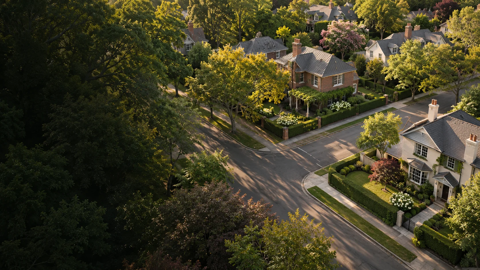
A neighbourhood.
A digital presence.
The Digital
Farm Challenge
I designed the logo for The Digital Farm Challenge, a programme intended to help early-career real estate agents build a presence in a particular neighbourhood through digital farming. The identity brings a local street map and a digital cursor into one recognisable mark.
- Client
- The Digital Farm Challenge
- Sector
- Real estate education
- Work
- Logo design & colour direction
- Designer
- João Queirós
- Shown here
- Final identity & application concepts
Make a digital idea
feel close to home.
The starting point was a focused brief: a programme or challenge that would teach real estate agents early in their careers how to concentrate their digital marketing on a particular neighbourhood. The name already held the idea of cultivating a place over time.
For the identity, I wanted the connection between real places and digital action to be immediately visible. The mark needed to introduce an educational programme while keeping its real estate context clear. A neighbourhood map offered a direct, familiar starting point.
A place to focus.
A way to connect.
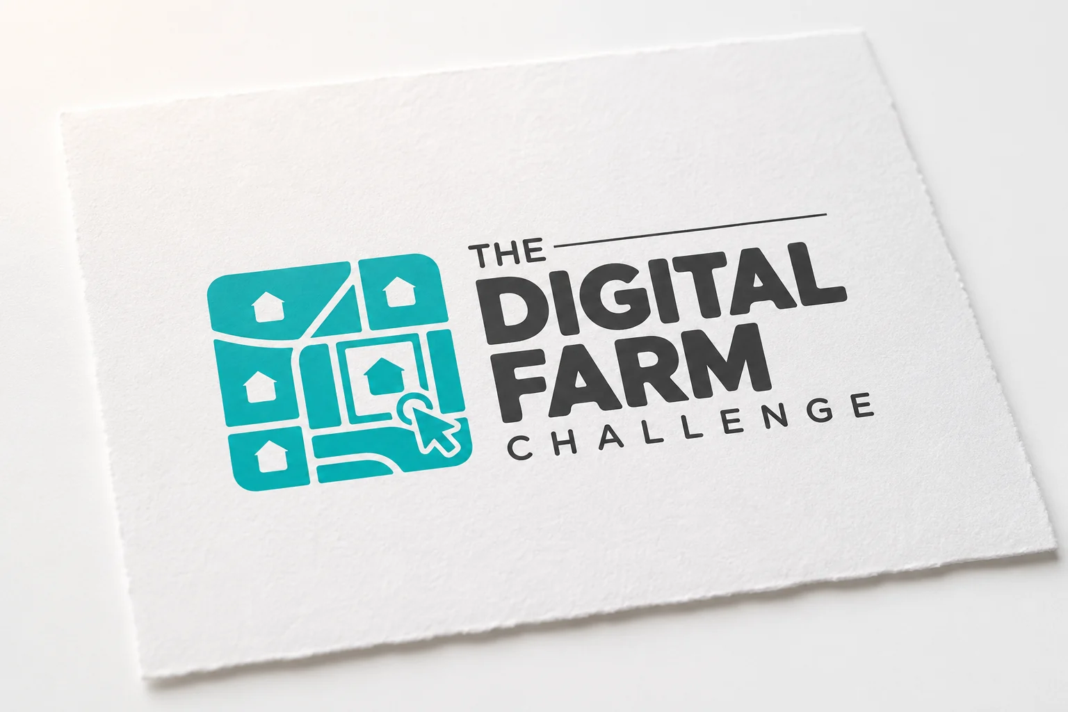
The symbol combines a small street network, individual houses and a cursor selecting a home. The streets give the mark structure; the houses bring the subject into focus. The cursor is the connection to the digital part of the programme.
The rounded outer shape holds those elements together as a single emblem. Alongside it, the bold wordmark gives “Digital Farm” the strongest emphasis, while “The” and “Challenge” complete the name in a quieter hierarchy. The contrast helps the full name remain organised within a compact lockup.
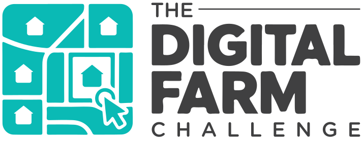 Primary identity
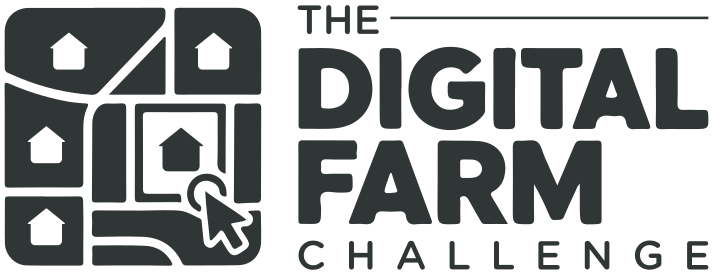 Monochrome
 Reversed
One clear visual
thread.
Turquoise gives the identity a bright point of recognition, supported by the weight of the charcoal lettering. White space keeps the detailed symbol legible and gives the longer programme name room to breathe.
For the portfolio applications, I extended the street-grid idea into supporting map graphics and simple framing devices. These concepts show how the same visual language could connect learning materials, a digital campaign and a presentation without relying on the logo at every scale.

Streets. Homes.
Digital connection.
Three familiar elements, held together in one mark.
The neighbourhood provides the structure.
The cursor gives it a digital point of focus.
From a first impression
to a learning environment.
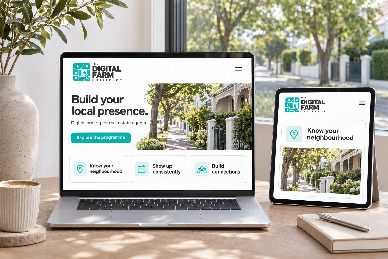
The proposed website pairs the identity with neighbourhood photography and a clear editorial hierarchy. A restrained interface makes space for the programme’s purpose, with the logo providing a consistent point of recognition across laptop and tablet layouts. This is a visual application concept, rather than a live course website.
Make room for local knowledge.
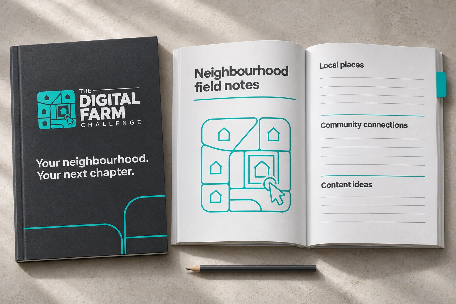
The workbook concept translates the identity into a physical learning tool. A charcoal cover gives the turquoise mark a strong setting, while the open pages leave room for observations about local places, community connections and content ideas. The focus is on useful space and a calm reading rhythm.
Build recognition, piece by piece.
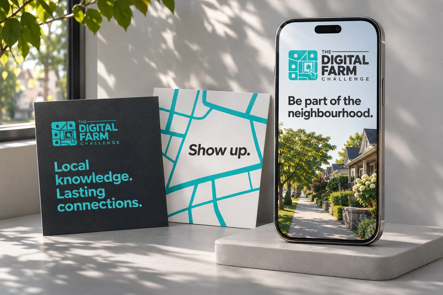
The campaign concept uses the same colours, typography and neighbourhood imagery across a phone screen and printed cards. Short messages leave the identity visible. The layouts explore how a consistent brand could show up across several touchpoints without making claims about the programme’s performance.
Bring the neighbourhood
into the room.
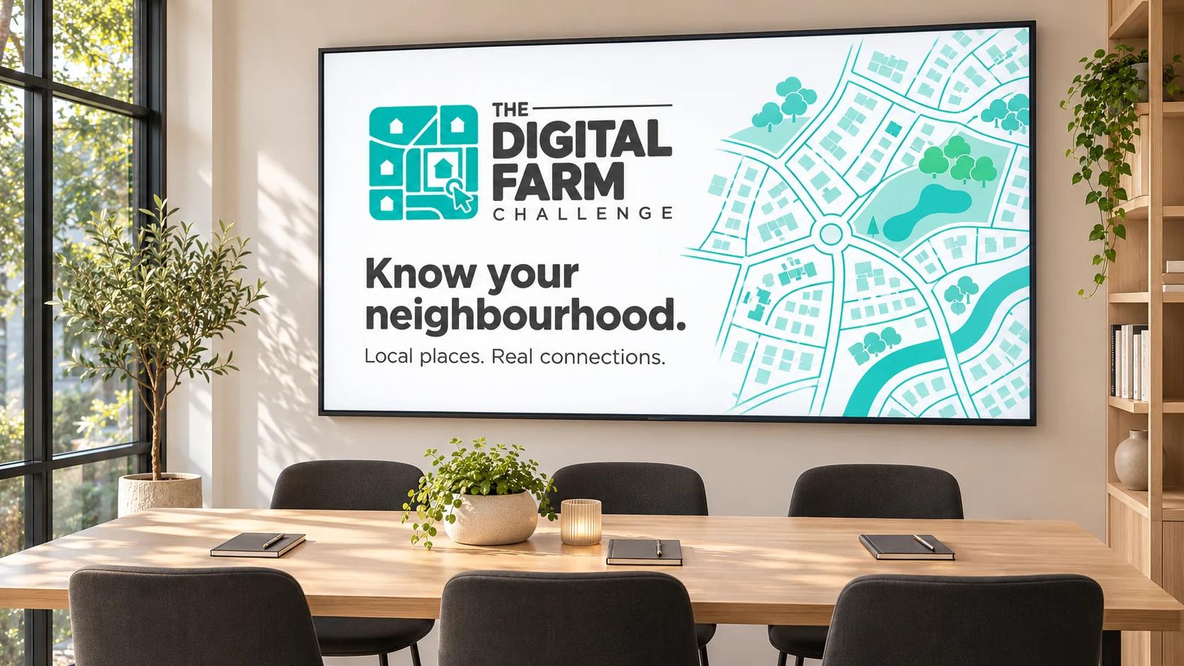
A presentation application gives the map language more space. The slide combines a clear headline, the full identity and a larger neighbourhood graphic. It explores how the brand could support a learning session, with enough clarity to work at the scale of a shared screen.
A local idea.
A connected identity.
A neighbourhood map makes the subject tangible. A cursor adds the digital connection. Together, they give the programme a clear visual starting point.
Clarity, down to the paper.
A simple paper presentation brings the attention back to the logo itself. Away from screens and supporting imagery, the relationship between the map symbol, turquoise colour and bold lettering remains the centre of the identity.
A little more context.
What is The Digital Farm Challenge?
The client described a programme for early-career real estate agents, focused on building a presence in a particular neighbourhood through digital farming.
What does the logo represent?
A network of streets and houses represents the neighbourhood. The cursor connects that physical setting with digital activity.
What work is shown here?
I designed the logo and colour direction. The photographic scenes, website, workbook, campaign and training presentation are portfolio concepts showing possible applications, rather than evidence of a live rollout.
A clear identity starts
with a good conversation.
If you’re building a programme, a service or a business with a story to tell, I’d be happy to discuss its identity.