
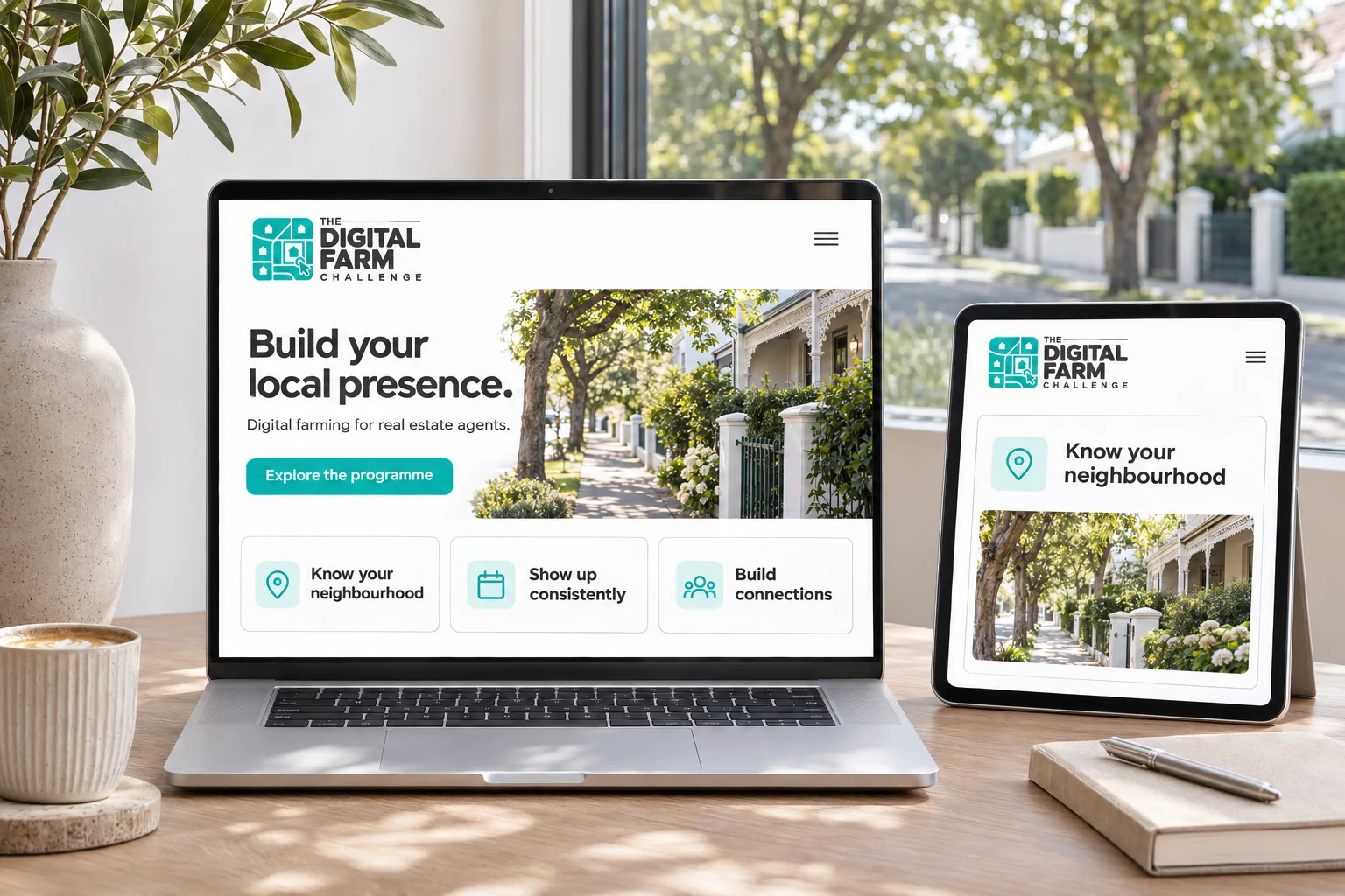
I’ve brought together a case study of my logo design for The Digital Farm Challenge, a programme intended to teach early-career real estate agents how to build their presence in a particular neighbourhood through digital farming.
The client’s brief was concise, but the relationship at its centre was clear: a defined local area and the digital activity that could help an agent become more familiar within it. That connection became the starting point for the identity.
A neighbourhood in one mark
The logo combines a street map, individual houses and a cursor selecting a home. Each element has a straightforward role. The map introduces the neighbourhood, the houses establish the real estate context, and the cursor brings in the digital connection.
Turquoise gives the symbol a clear point of recognition beside the bold charcoal wordmark. The lettering places emphasis on “Digital Farm”, with the rest of the name arranged around it. Colour and monochrome versions keep the same underlying structure.
Exploring the identity in context
For the portfolio presentation, I developed application concepts that show how the identity could extend into a programme website, a workbook, a mobile campaign and a training presentation. Neighbourhood photography and supporting map graphics connect the different formats.
I wanted the presentation to show both the character of the final mark and how its visual language could work in use. The paper detail and clean identity boards bring the story back to the logo; the application scenes explore its wider possibilities.
The website, learning materials, campaign and training space are portfolio concepts. They illustrate possible uses of the identity and do not document a launched programme or client results.
The full case study follows the brief, the design decisions and the visual applications. If you’re planning a programme or business of your own, you can also explore my brand identity design services or get in touch about your project.