Ride Water Sports Brand Identity
A bold, modern identity for a boating and water sports brand built around tours, foiling, wakeboarding, and instructional content.
The Brand
Ride is a boating and water sports brand focused on creating memorable experiences on the water through boat tours, foiling lessons, wakeboarding lessons, and online instructional content.
The company brings together lifestyle, adventure, and education, helping people enjoy the water with more confidence, energy, and freedom. The identity needed to feel active and approachable while still being simple enough to work across boats, gear, lessons, and digital learning.
The Design
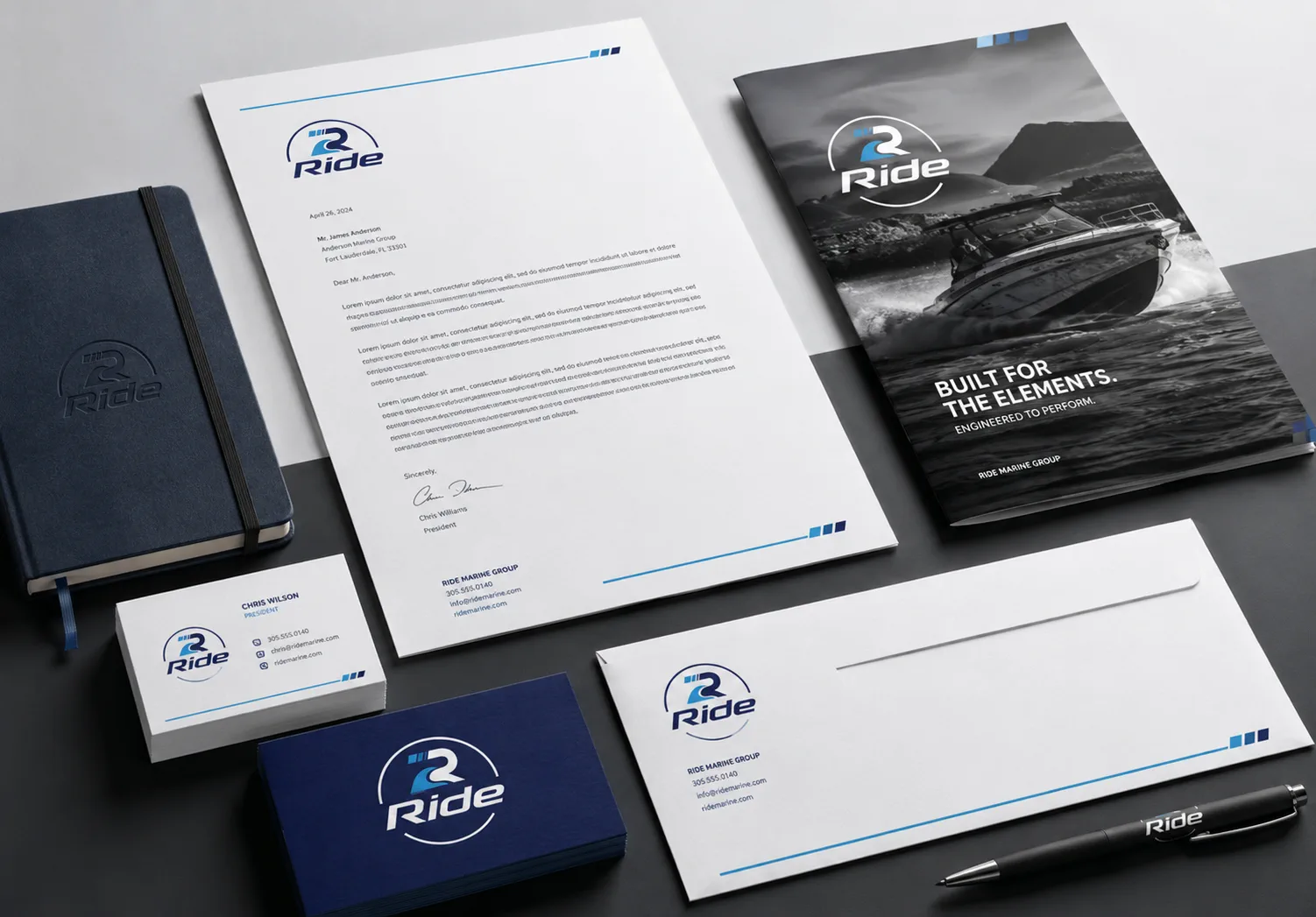
The brief called for a blocky, flat logo system with no gradients and a focused palette of black, blue, and grey. I built the identity around a strong wordmark and a flexible symbol that can work as a full logo, standalone wordmark, or compact badge.
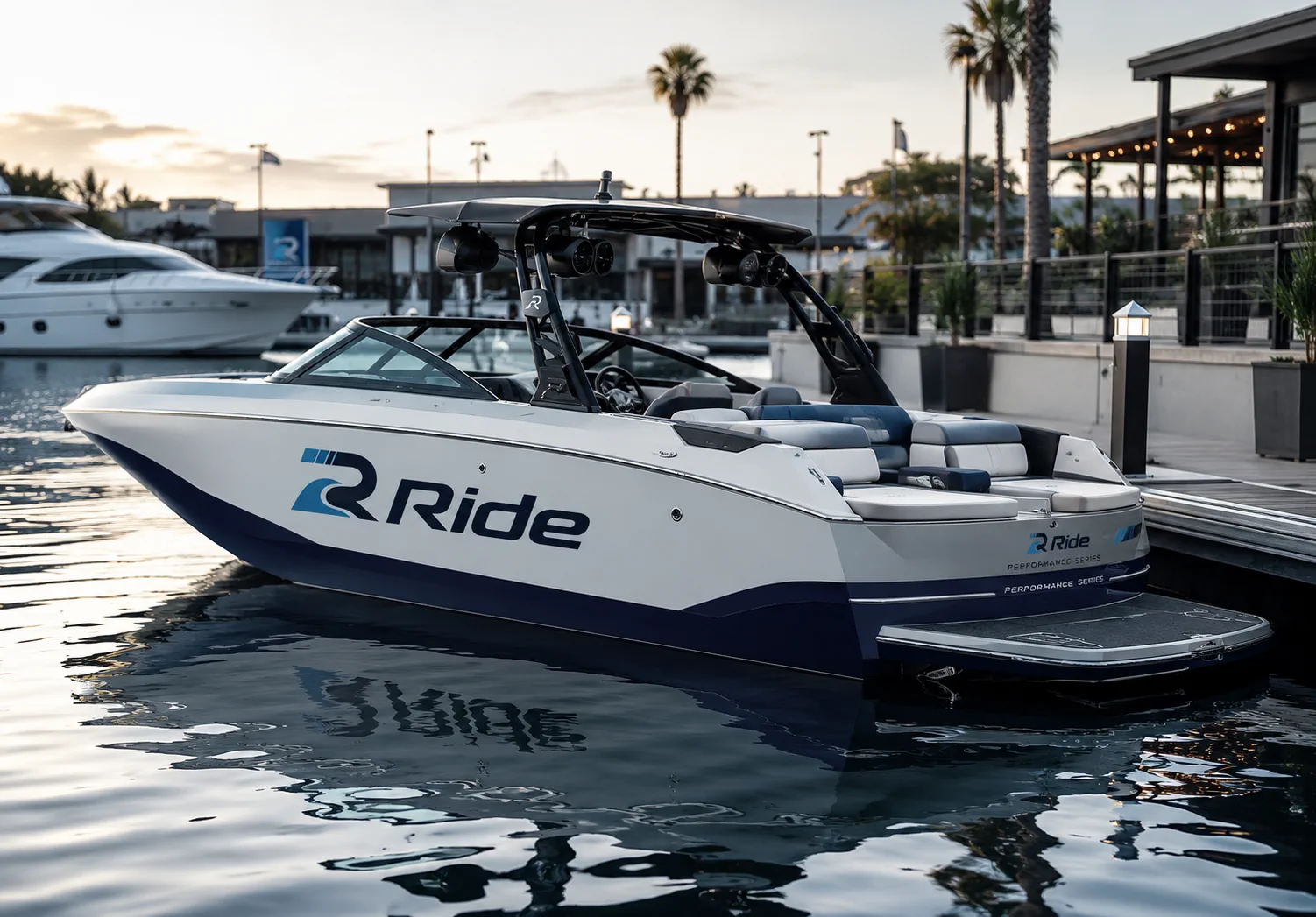
The Ride mark was built around a dual reading: a bold initial R and a rising wave. The symbol connects the brand name to motion, water, progression, and confidence, while the open circular frame gives the identity a badge-like quality for boats, apparel, gear, signage, and digital lessons. The blocky flat construction keeps the system modern and easy to reproduce, and the small speed bars reinforce forward momentum, wake trails, and the feeling of learning to move with more confidence on the water.
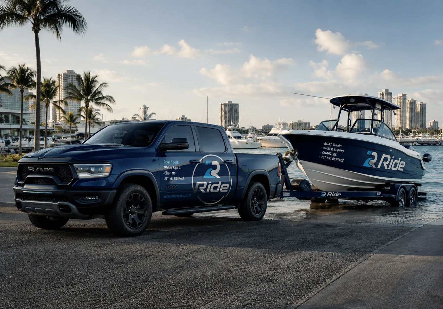
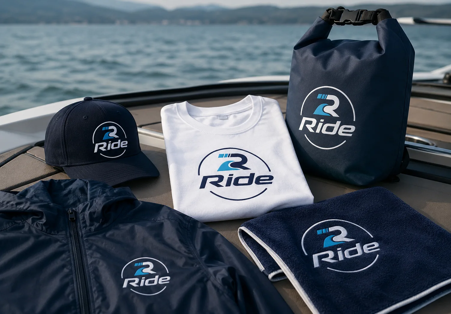
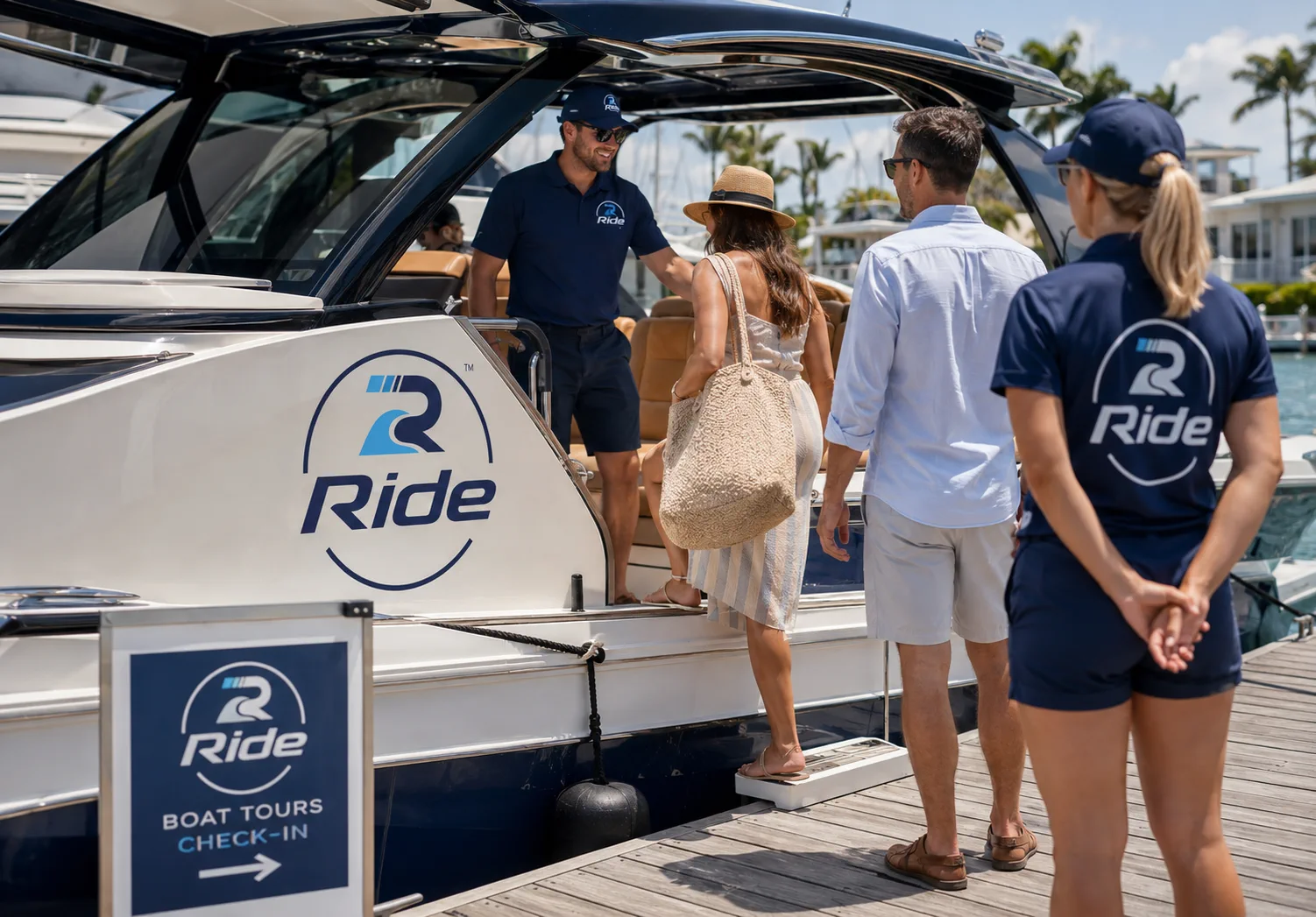
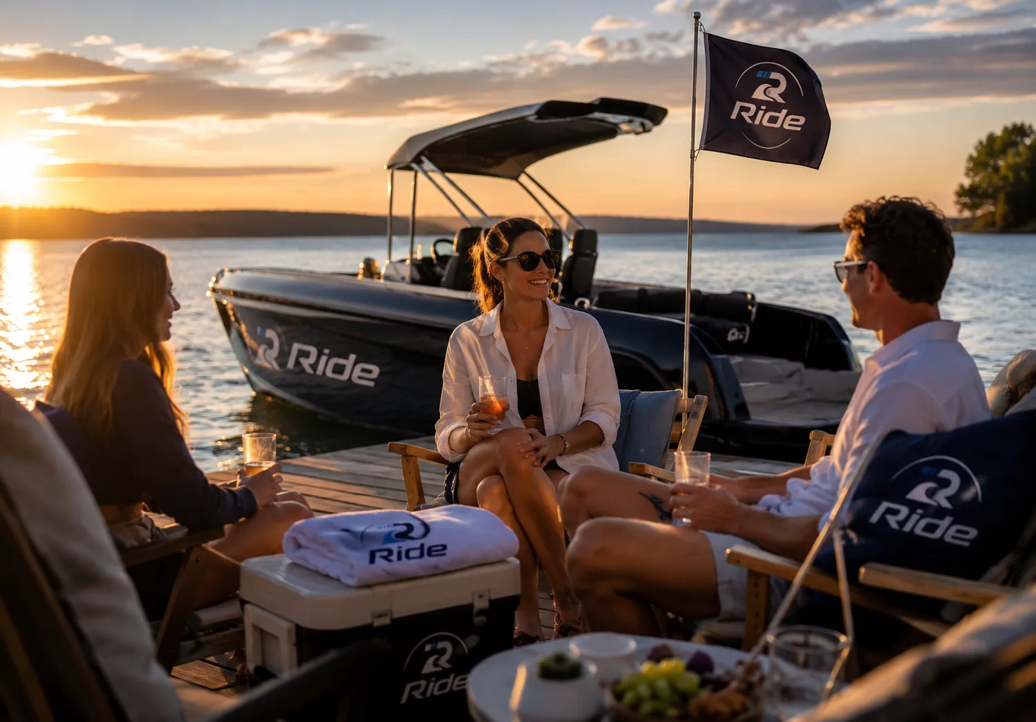
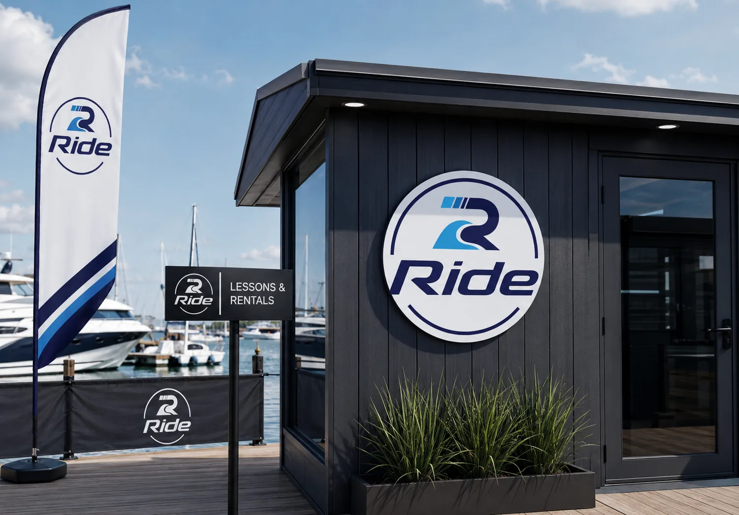
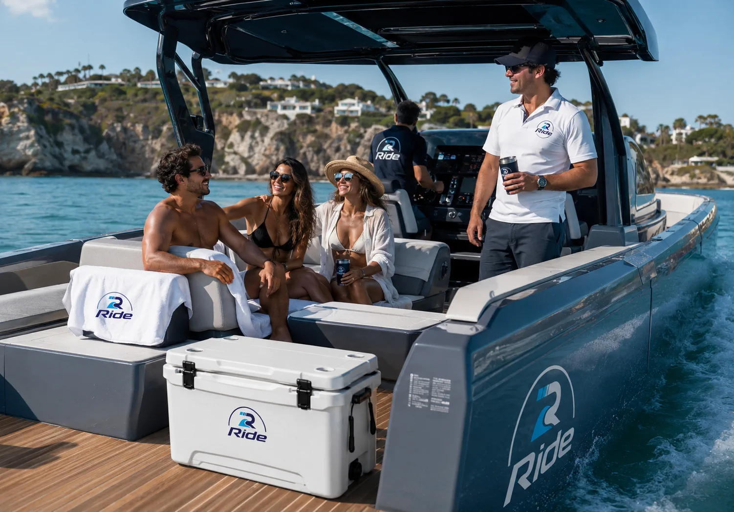
The Identity in Use
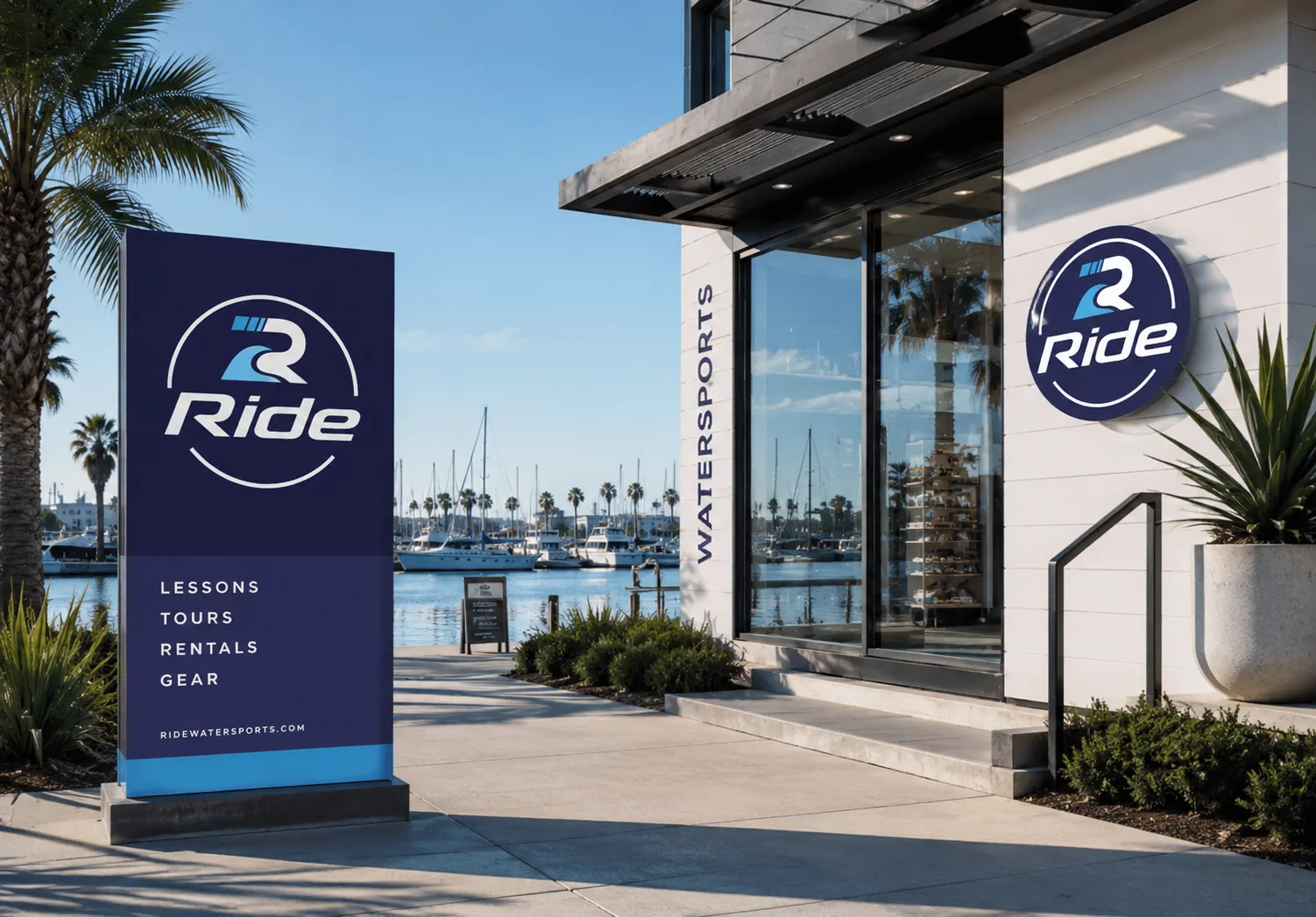
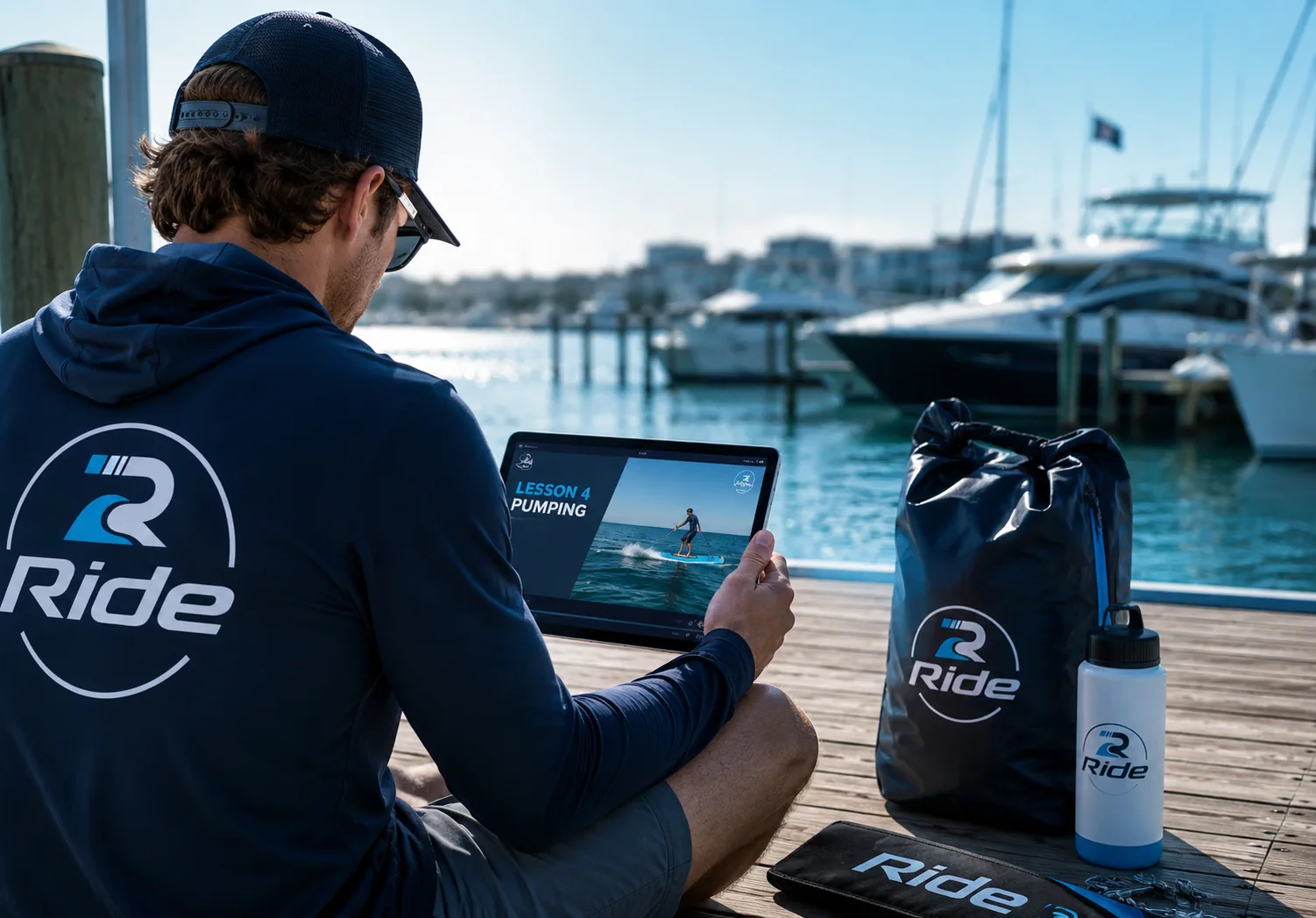
The brand was extended into the touchpoints people would meet before, during, and after a day on the water: boat graphics, marina signage, apparel, dry bags, onboard collateral, lesson gear, and digital instruction.
That mix matters because Ride is both an experience brand and an instructional platform. The identity has to feel exciting enough for tourism and adventure, but clear enough for education, confidence-building, and repeat use.
The Result
The finished system gives Ride a memorable identity that feels active, confident, approachable, and ready for both real-world water experiences and online content. The R-wave mark creates an instant visual hook, while the wordmark and badge structure keep the brand simple, recognizable, and easy to apply.
This project is part of the brand identity design services I offer to clients worldwide.


Your next client's first impression starts here.
Let's create a brand identity that turns your offer into something people remember.
1,200+ brands. 40+ countries. Since 2014.