
Wake Up Sports · Two series · 2026
Wake Up SportsFilms
Fourteen films for one loud sports brand. Seven cut hard. Seven shot in one continuous take, with zero cuts. Scroll, and the camera keeps going.
Watch the filmsThe brief, in the brand's own words
It doesn't whisper.It doesn't ask for attention.It takes it.
Wake Up Sports · Brand Standards Guide
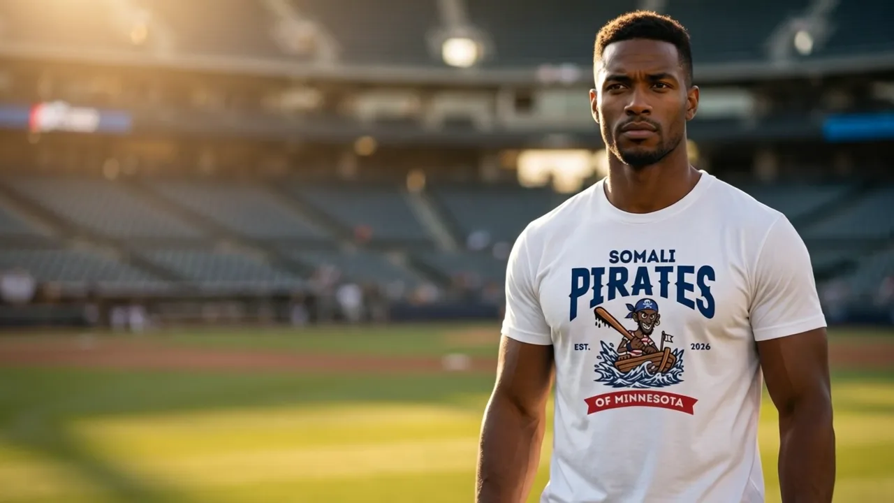
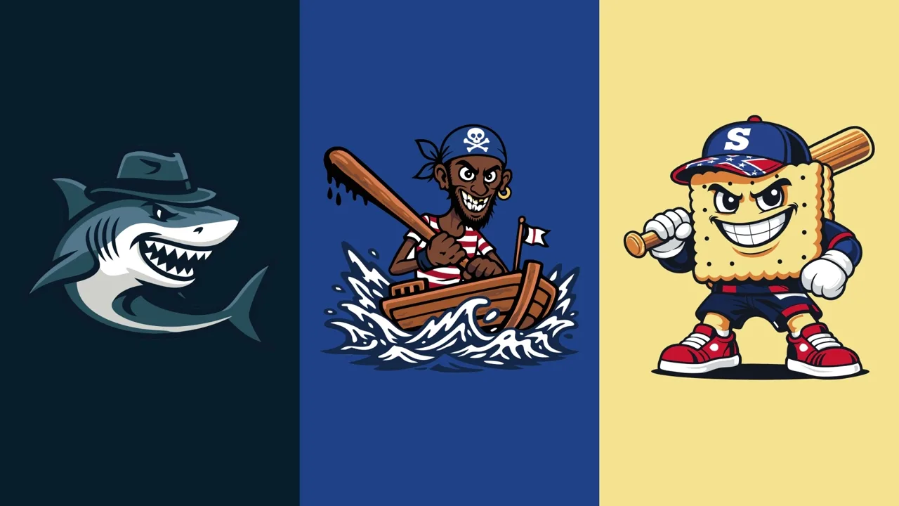
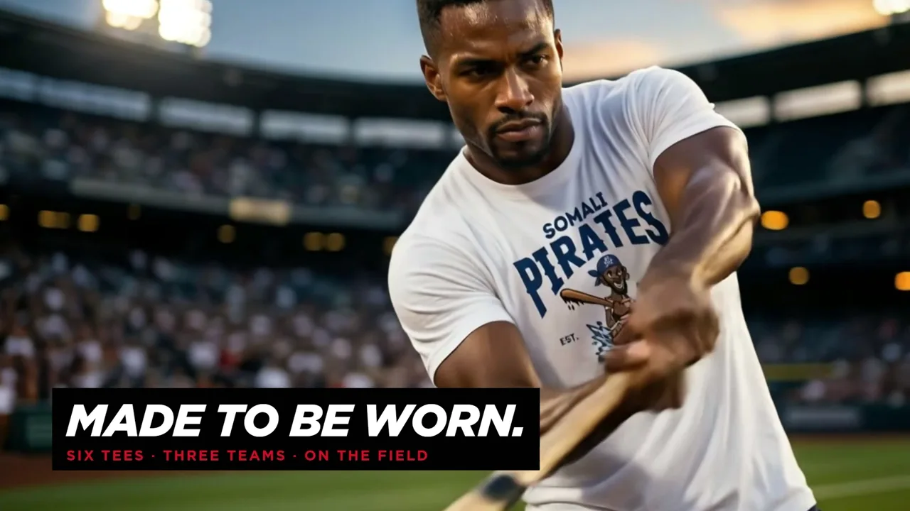
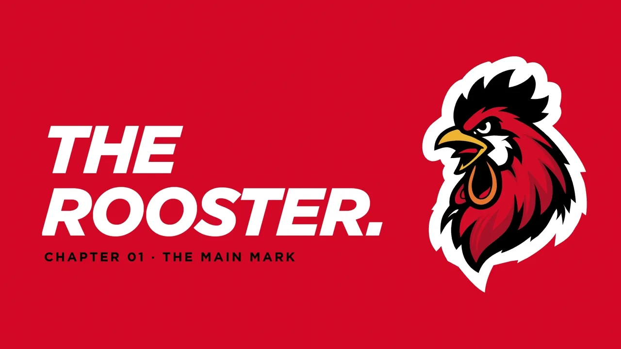
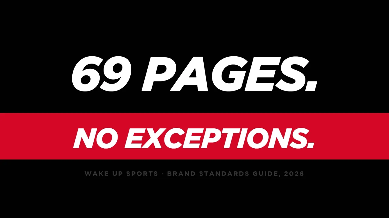
I designed the Wake Up Sports identity: the rooster, the crest, three teams, the merch drop and a 69-page brand guide. A brand this loud can't sit still on a slide, so I made it move.
Two series tell the same seven chapters. One Take has one rule: a single continuous camera per film, worlds joined through frames of pure colour, never an edit. Wake Up Call is cut hard and fast.
Series 2
One Take
Seven films. Zero cuts.
The same seven chapters, shot again as one unbroken camera move each. The counter in the corner never leaves zero.
Series 1
Wake Up Call
Seven films. Cut hard.
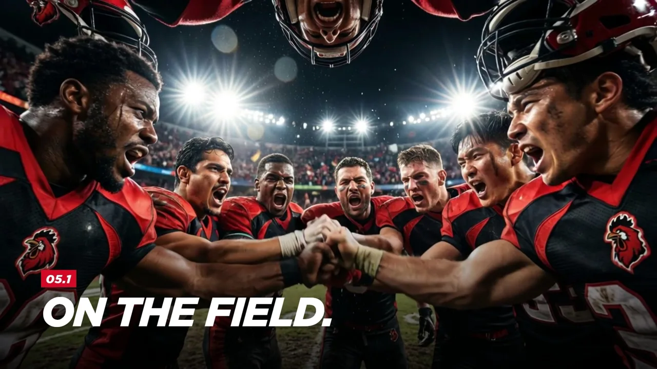
The identity, chapter by chapter: the mark, the league, the drop, the rulebook and the brand out in the wild. Hover a fixture to preview it, click to watch.
Head to head
Cut vs one take
Same chapter, two ways to shoot it, playing in sync. Drag the red line. The sound follows whichever side is winning.
Full time
The numbers.
- 2SeriesWake Up Call and One Take
- 14FilmsEvery one of them public
- 3TeamsGreat Whites, Pirates, Saltines
- 69PagesOne brand standards guide
- 26SightingsCounted in One Take 05
- 0CutsAcross all seven One Take films
Built for the phone too.
Credits
Your brand deserves a wake-up call.
Identity, motion and direction by one designer in Porto. If your brand needs to be seen, not scrolled past, let's talk.
- ClientWake Up Sports
- Identity and brand guideJoão Queirós
- Motion, edit and directionJoão Queirós
- Films14 · 2026
- Formats16:9 and 9:16