The S
A direct initial, drawn as a compact path rather than a decorative letterform.
This was not a client brief. I built Snapline to bring order to my own screenshot workflow, then created an identity that turns capture, filing, and retrieval into one precise symbol.
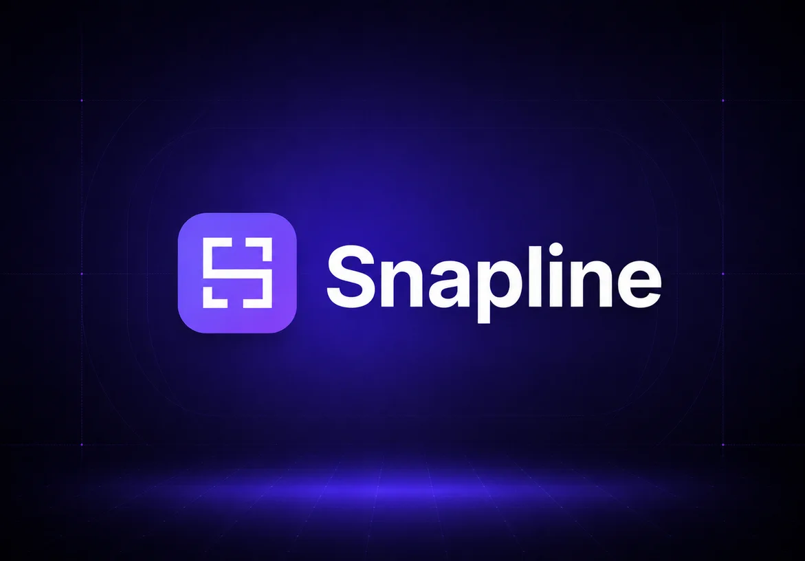 Local · Windows · 2026
Most identity projects begin with someone else’s brief. Snapline began with my own folder full of screenshots and one persistent question: why should capturing something be separate from filing it and finding it again?
I built the Windows app around a simple local-first loop. Choose the active project, take the capture, and the file lands in a real folder on disk. Offline OCR makes the words inside each image searchable. The editor turns a raw screenshot into something ready to explain, present, or share.
Because I was both the designer and the user, the identity could come from the product’s real behavior. It did not need a borrowed technology metaphor. The act of selecting an area, snapping it into place, and keeping the result findable was already enough.
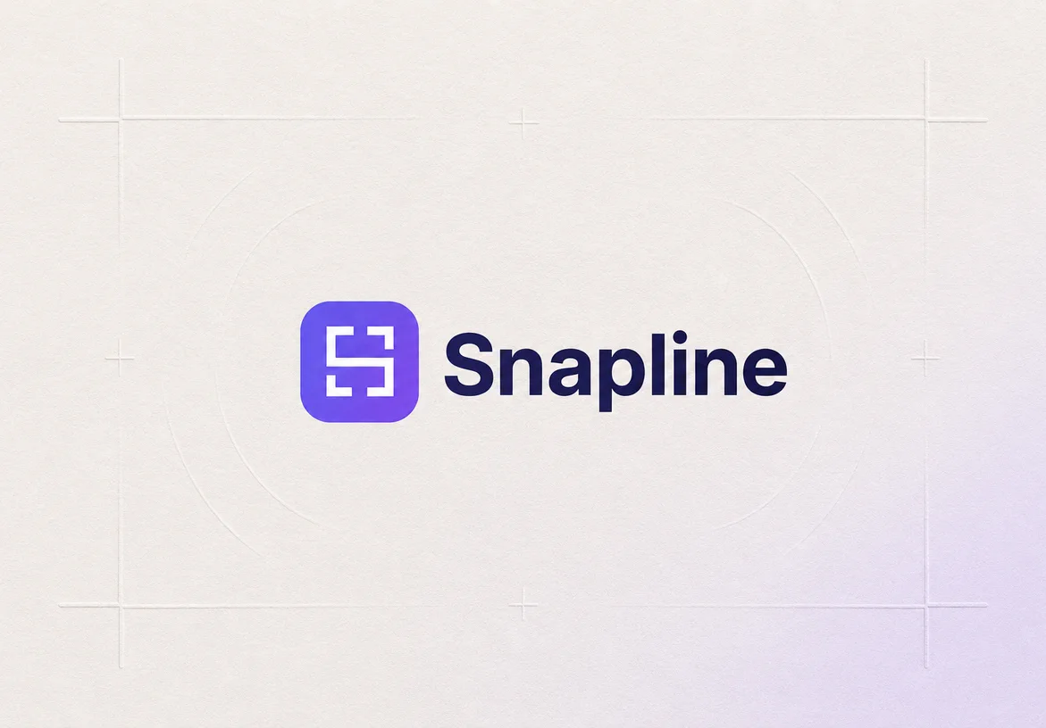
The mark starts with an orthogonal S for Snapline. Its interrupted corners borrow the visual language of a screen-selection frame, while the central path connects the moment of capture to the place where the file belongs.
The gaps are intentional. They create the feeling of an active selection and keep the monogram open, crisp, and legible at app-icon size. The rounded square gives the mark a native home on Windows without weakening the geometry inside it.
A direct initial, drawn as a compact path rather than a decorative letterform.
Open corners recall the handles that define a screenshot selection on screen.
The route through the mark reflects capture, filing, and retrieval as one connected action.
A rounded container gives the symbol presence as an app icon, shortcut, and small interface mark.
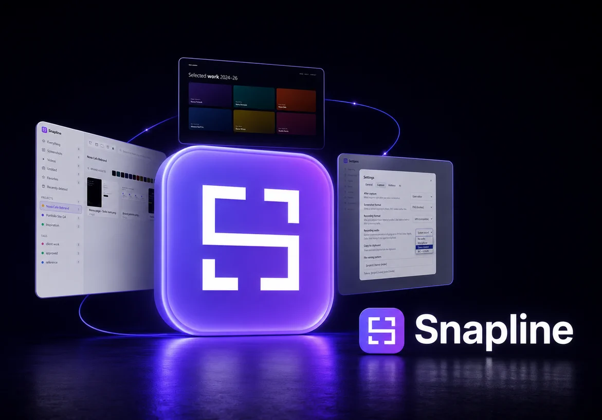
The geometry stays recognizable when the atmosphere changes. Paper makes it editorial, glass makes it feel native to the interface, and the violet horizon turns it into a clear product signal.
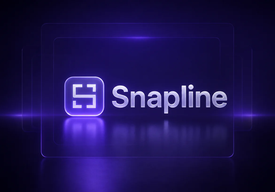
Snapline’s violet focus states, crisp selection corners, light work surfaces, and dark presentation frames all grow from the same visual logic as the logo.
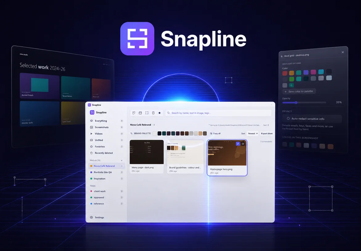
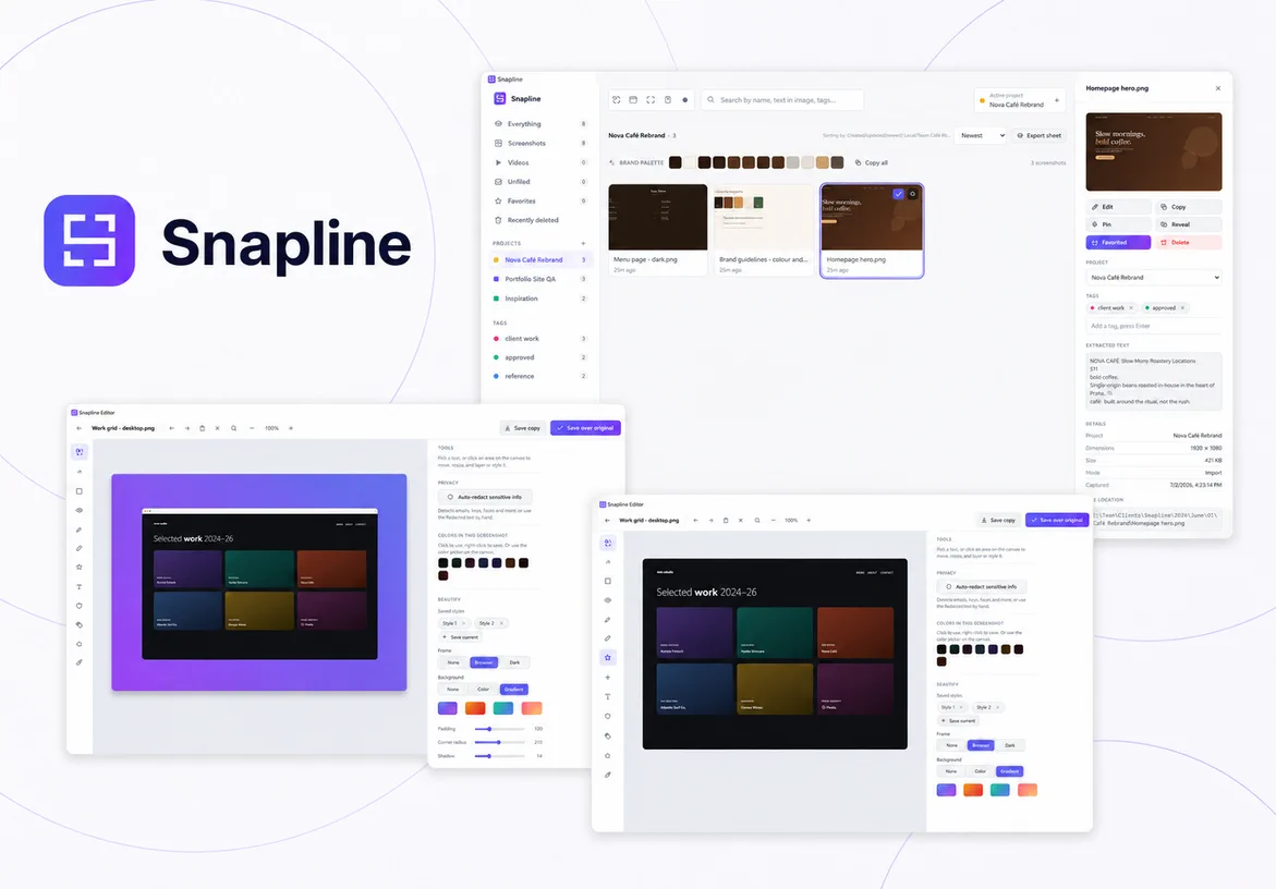
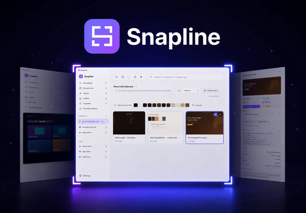
A short product film showing how Snapline turns capture, real project folders, offline search, and editing into one focused workflow.
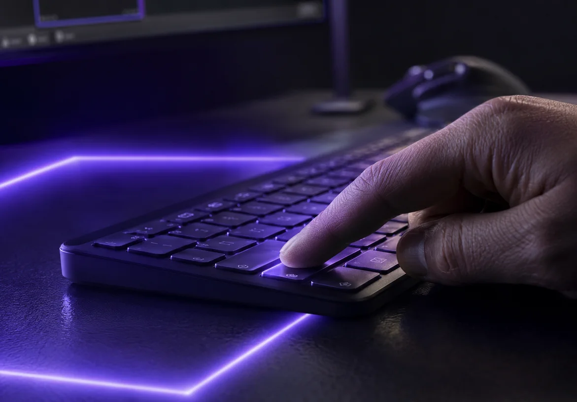
The brand becomes most convincing when the product is doing the job it was made for. Snapline moves from a shortcut to a real project folder, then into an editor built for useful, presentable captures.
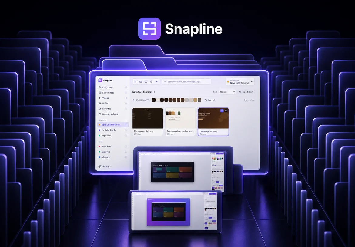
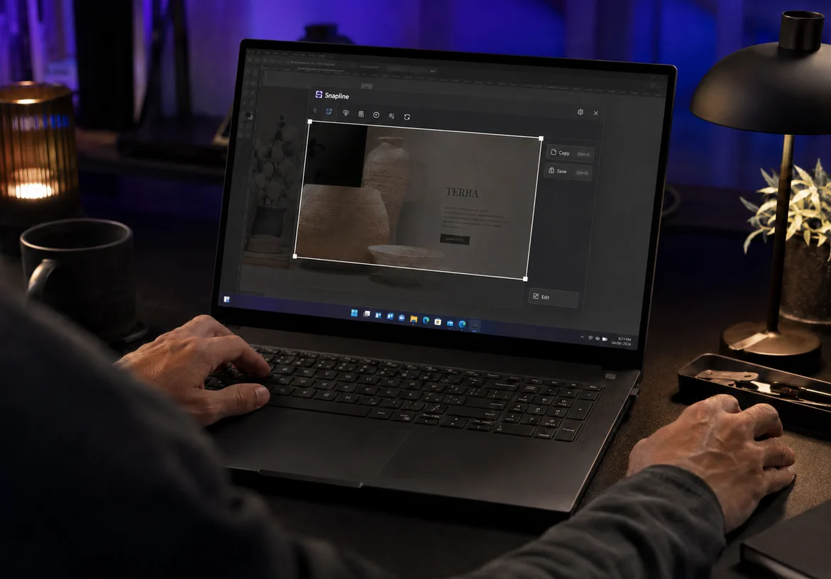
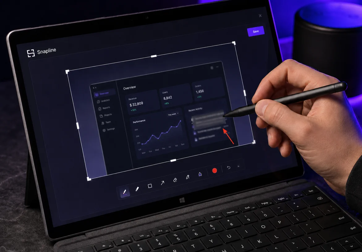
Snapline gave me the opportunity to work as the product’s maker, user, and brand designer at the same time. Every decision could be tested against a real interface and a real daily workflow.
The finished identity is compact enough for a Windows app tile, clear enough for a keyboard shortcut, and expressive enough to carry a full launch. More importantly, it feels inseparable from the product it represents.
I design identities that make the product idea clearer, more credible, and easier to remember.
1,200+ brands · 40+ countries · Since 2014