
A menu should inherit the brand’s typographic voice, palette and selected graphic elements, organized around clear dish descriptions and prices. Build reusable rules for changing content, and check the result in the lighting, size and format guests actually use.
The menu has its own communication job
A restaurant’s identity may begin with a mark, but the menu is where guests spend time reading. It needs to express the venue and help someone make a choice. A lively illustration system can support that experience while a disciplined text hierarchy keeps practical information easy to find.
I would begin with the real content: section names, dishes, descriptions, prices and the information the business needs to communicate. A layout built around short placeholder dishes can fail as soon as the kitchen supplies the actual list.
Learn from a complete hospitality expression
Emily Gosling, BP&O: Bar Rêve identity by Dutchscot, 29 October 2026 describes Dutchscot’s identity for Brooklyn’s Bar Rêve spanning print, digital, signage and merchandise. The project provides a useful reference for thinking across the guest experience.
My recommendation is to give the menu a defined role within that larger identity. The observations below are my framework for menu design, not a report of Bar Rêve’s menu testing or commercial performance.
Decide what the menu inherits
| Brand asset | Menu application | Practical boundary |
|---|---|---|
| Typography | Section headings and body hierarchy | Keep dish details legible |
| Color | Section markers or restrained accents | Check contrast in the intended setting |
| Illustration | Borders, dividers or selected highlights | Protect space around prices and descriptions |
| Voice | Dish introductions and supporting copy | Preserve accurate product information |
| Layout rhythm | Spacing and repeated alignments | Allow long names and content changes |
The logo does not need to appear beside every dish. A recognizable border, a specific heading treatment or a consistent palette can carry the identity more quietly. Use the strongest assets where they help establish the experience, then give the content room.
Build with the difficult entries first
Try the longest dish name, the fullest description and a section with only two items. Include the actual price format. Check what happens when a seasonal addition wraps onto a second line. These cases tell you more about the system than a page of conveniently equal entries.
For a hypothetical neighborhood restaurant, a simple two-column menu might work until a detailed drinks list is added. Rather than shrinking all text to force it onto one page, reconsider grouping, sequence and format. The brand should survive that adaptation without turning every update into a redesign.
Review at the table and on a phone
Print a proof at its final size and look at it in representative lighting. Ask someone to find a dish, locate its price and distinguish section labels from descriptions. For a digital version, repeat the task on a narrow screen with real content rather than relying on a reduced image of the printed page.
These are proposed usability checks. They can uncover a reading problem, but they do not prove increased spend or a preferred menu psychology. The useful outcome is a guest who can understand the offer and a team that can keep the material accurate.
Carry the identity through everyday details
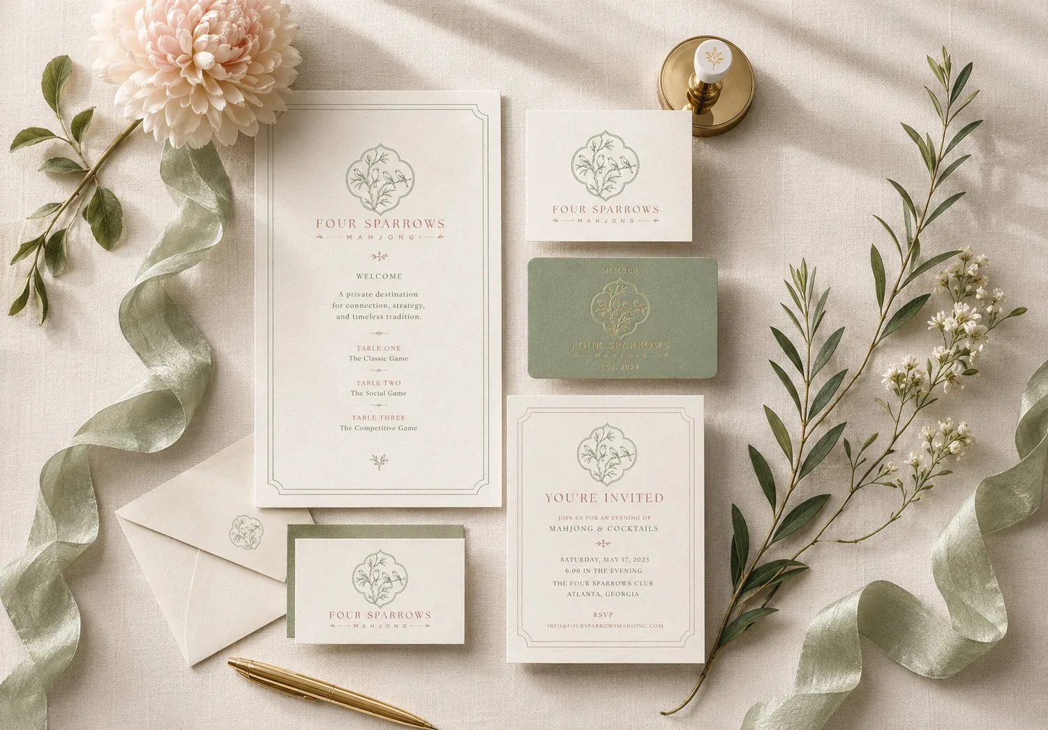
My My Tacos work includes a repeatable taco-and-margarita pattern used in menu borders and other applications. In Four Sparrows, menu cards sit within a wider family of invitations and membership materials. Those are concrete ways an identity can reach beyond a sign.
- Agree the text hierarchy before decorating the page.
- Use real names, descriptions and prices in the template.
- Check final-size print and narrow-screen versions.
- Specify how seasonal content enters the system.
- Assign someone to review content before each export.
My hospitality identity and collateral services connect these decisions so the menu feels intentional and remains usable after the launch photographs have been taken.
Frequently Asked Questions
Should a menu use the same typeface as the logo?
Only when it works for the reading task. A logo’s fixed lettering may be unsuitable for descriptions and prices. Use a compatible, legible supporting typeface when needed.
Can the printed menu simply become an image on the website?
An image may be hard to read on a phone and difficult to navigate. Plan a responsive text version where possible and keep the information consistent with the printed edition.
Sources and Credits
Created and sources checked on 2 November 2026. The editorial date places this article in the requested series; it is not a claim of earlier publication. External projects are credited to their creators. The review frameworks and hypothetical examples are design recommendations, not measured client outcomes.
Bring your current menu and brand assets. We can build a coherent reading system for the printed and digital versions your guests use. Book a free consultation or explore design services.