
Test the mark at actual dimensions and realistic viewing distances on the intended materials. Identify details that disappear or close up, then create and document only the variants that solve genuine production problems.
Scale is more than resizing
A vector file can be enlarged without pixelation, but fine details do not automatically remain legible on a narrow spine, an embroidered patch or a distant sign. Each application introduces a different combination of physical size, viewing distance, material and lighting.
The Poetry Foundation: New brand identity, 28 September 2026 describes its Pegasus identity as intended to work from a magazine spine to public installations, with four poses. The announcement demonstrates the range of applications; it does not establish a universal minimum size for other marks.
Choose the extremes before the middle
List the smallest important reproduction and the furthest common viewing distance. Add a typical digital use and a one-color use. Record the actual dimensions, production process, expected background and surrounding visual clutter for each.
Print the small version at its intended size. View a full-size sign mockup from the expected distance when practical, or work with a sign maker on a representative proof. Compare dark and light backgrounds. Ask people unfamiliar with the design what they can identify and which details disappear.
Diagnose the failure
If a thin stroke vanishes, check the production method and supplier tolerance first. If letters merge, spacing or a simpler small-size version may help. If the symbol reads but the tagline does not, remove the tagline from the compact variant rather than enlarging the entire mark beyond the available space.
Do not use a single arbitrary pixel value for every context. A minimum size for a clean digital SVG can differ from one for stitched fabric or etched metal. The specification should state both the size and the method for which it applies.
Document the result
- Primary and compact versions with clear usage conditions.
- Minimum dimensions tied to the relevant reproduction method.
- Approved one-color treatments and background contrast examples.
- Clear space, alignment and a named contact for exceptions.
- Supplier-approved proof or sample where production requires one.
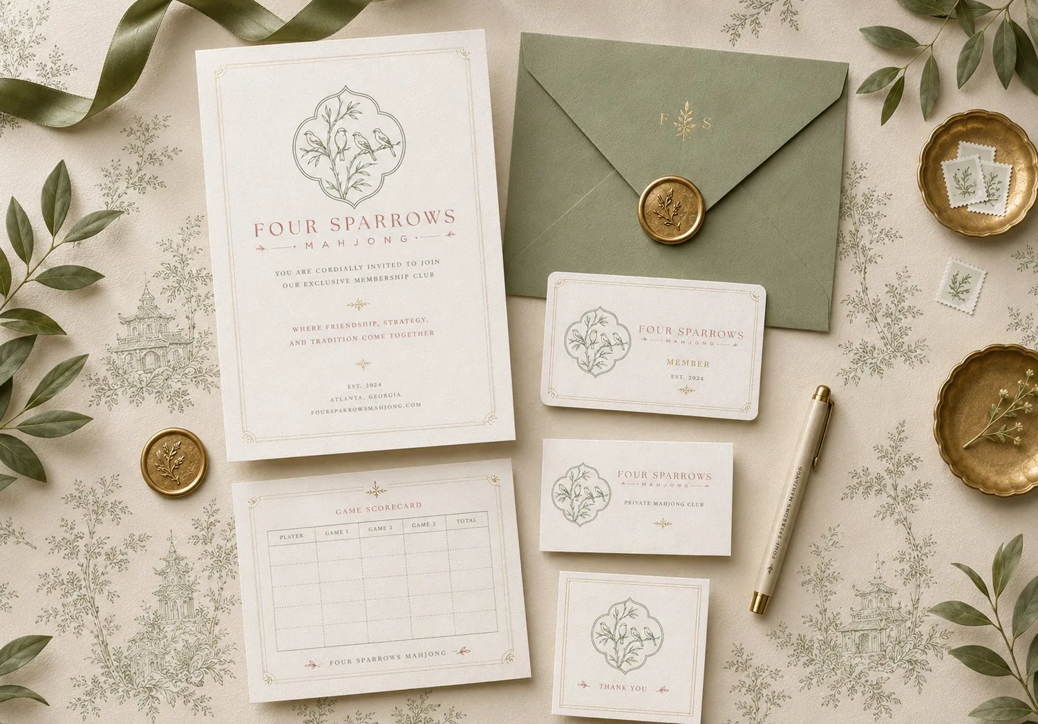
My logo and identity work considers the complete set of applications, not only how the mark looks in isolation. Testing makes the final decision more reliable, but results should be recorded as observations rather than presented as a statistically representative study.
Frequently Asked Questions
Can one logo work at every size?
Sometimes, but a detailed mark may require a simplified approved version for small or difficult applications.
How do I set a minimum logo size?
Test the actual artwork in the intended process and material, then document the smallest size that remains legible for that application.
Sources and Credits
Created and sources checked on 19 October 2026. The editorial date is the requested place in the series, not a claim of earlier publication. Reported examples are attributed above; frameworks and fictional scenarios are design recommendations. Portfolio examples are my own work and do not imply measured client outcomes.
If your mark has to work across print, product and signage, map those applications before the final artwork is approved. Book a free consultation or explore design services.