
A frame earns its place when it gives varied content a recognizable structure, establishes hierarchy or creates a useful relationship between image and message. Define what the frame does before making it a repeated decoration. Test it on content that is awkward as well as content that fits easily.
Give the frame a job
A rectangle around a photograph may be a border. A brand framing device can do more: organize a message, establish a recurring composition or connect images that look very different. The distinction becomes clear when the system has to handle ordinary content rather than a single selected hero image.
I would ask what problem the frame solves. If it merely fills space, the identity may become more complicated without becoming more useful. If it helps a team place a portrait, an announcement and a product image within a recognizable family, it has a practical role worth developing.
SMK’s frame as a reference
eTypes: SMK creator case study, undated, checked 16 November 2026 explains an identity built around a typeface, a crown and a frame. The studio describes the frame as a structure that adapts to different exhibitions, formats and content while retaining the museum’s presence.
My takeaway is the relationship between a stable device and changing subject matter. The reference supports that design observation. It does not imply that every cultural brand needs the same geometry or that a frame alone produces recognition without consistent use.
Define what stays fixed
| Decision | What to define | Why it matters |
|---|---|---|
| Geometry | Proportion, weight and permitted changes | Keeps the device recognizable |
| Image relationship | Inside, behind or beside the frame | Protects subject and hierarchy |
| Text relationship | Spacing and permitted overlaps | Makes the message readable |
| Format changes | Portrait, square and wide versions | Avoids improvising every crop |
Choose only the rules the team needs. A small business using a handful of templates may benefit from a limited set of approved compositions. A content-rich organization may need more flexibility, with examples showing when the device should become quieter or disappear.
Protect the meaning of the image
Use a test set containing a close portrait, a wide scene, a detailed product, a busy photograph and a text-only announcement. Check what is lost when each enters the frame. A crop that removes an essential detail can change the meaning of the content even when the composition looks tidy.
Mark protected areas where needed and provide an alternative layout when the preferred crop is unsuitable. Avoid treating a supplied artwork as raw decoration. Permissions, credits and any restrictions should travel with the asset so the person adapting the template can make an informed choice.
Coordinate the surrounding system
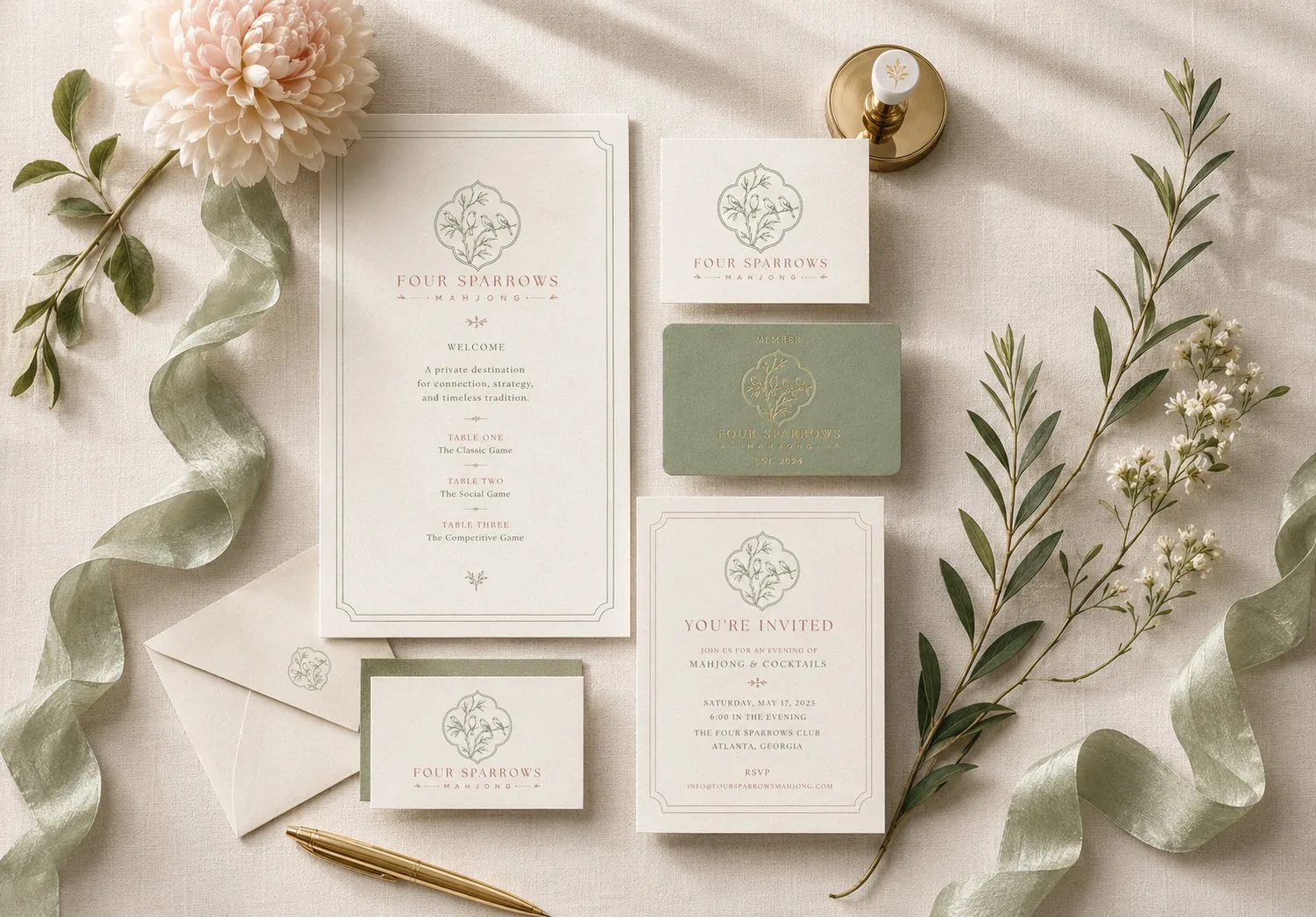
My Four Sparrows invitation suite is an adjacent example of coordinated identity across several pieces. Compare the type, spacing and supporting elements as a family. It is not an SMK commission or a claim that the same frame strategy was used.
In a new project, I would review the frame alongside typography and color. If all three compete for attention, the subject can become secondary. The useful question is which element leads in each layout and how the business remains recognizable when the content needs more room.
Handoff templates with an escape route
Include approved examples, editable templates and a short note explaining when to choose another layout. Show the frame with unusually long titles and imperfectly shaped images. A system that works only with ideal assets will push the team toward unauthorized workarounds.
Finally, ask someone outside the design team to build a sample. Their hesitation reveals which decisions are missing from the guide. A visual identity system becomes useful when the next person can preserve its character while handling the content the business actually needs to publish.
Frequently Asked Questions
Does every branded image need a border?
No. A framing device should have a defined role, with exceptions where it would crowd or misrepresent the content. Repetition is useful only when the device helps the communication.
Can the frame change shape between formats?
Yes, if its recognizable characteristics and permitted changes are defined. Show approved adaptations in the templates and test awkward images and long titles before handoff.
Sources and Credits
Created and sources checked on 16 November 2026. The editorial date places this article in the requested series; it is not a claim of earlier publication. External projects are credited to their creators. The review frameworks and hypothetical examples are design recommendations, not measured client outcomes.
Share the images and formats your team struggles to fit together. We can decide whether a framing device would make the identity more useful. Book a free consultation or explore design services.